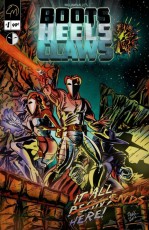
Camel Moon Studios reaches for the stars with Boots Heels Claws #1, an adventure filled science fiction comic. Will they crash and burn upon launch? Find out below.
 BOOTS HEELS CLAWS #1
Writer: William Valle
Artist: William Valle
Inker: William Valle
Colorist: William Valle
Letterer: William Valle
Cover Artist: William Valle
Editor: William Valle
Publisher: Camel Moon Studios
Price: $.99
Previously in Boot Heels Claws: In 2020 Earth was defeated by a mysterious force that came without warning. Heroes and Villains alike were crushed in an instant as they fought side by side against a helmed man known as Robust. Now, special agents Boots and Heels are on a mission to go back in time and save the earth.
RETRO FUN FOR A HEFTY PRICE
If nothing else, Boots Heels Claws #1 had a lot of promise. It opens on a history of the events thus far, revealing the story of Earth’s demise. Valle’s writing offers enough plot hooks to set the stage nicely for the following scenes, but sadly from there it’s all down hill. The writing seems kitschy and rather than pulling readers in, it alienates them with a temporal and locational shift that reads more like an 80s rip-off than an old-timey adventure story. Following a mission, our dynamic duo, displaying a Get Smart-esque degree of competence, exchanges some rather camp dialogue with some faceless minions before disappearing into a spaceship and heading back to base. Unfortunately this is where some of the weakest writing appears. Boots and Heels are flat and uninteresting, with largely unimaginative banter. It all feels very done.
The story begins to feel forced in the following scene, effectively losing any readers who’d managed to cling to the interest generated thus far. Boots and Heels flirt cheekily, only for the story to be pulled rather violently back to the plot, with heavy exposition in the guise of a mission briefing. Boots and Heels are to be sent back in time in search of a hero named the Clawed-Agent, but as Boots quickly discovers, New York City lies in ruin 4 years ahead of schedule. It is on this cliffhanger that the issue ends, leaving a rather disappointing feeling behind.
SPACE IS HARD ON THE EYES
Boots Heels Claws #1 suffers from one very serious flaw in its production: it’s impossible to follow. The art is entirely black and white, with most of the negative space being filled in completely with black. This stylistic choice makes it nearly impossible to tell what is going on in each panel. Readers are constantly left wonderings “Is that a shadow or a mouth?” which slows the reading process down to a painful degree. The pages are also extremely busy, with action lines, intense backgrounds, and figures that blend into the page.
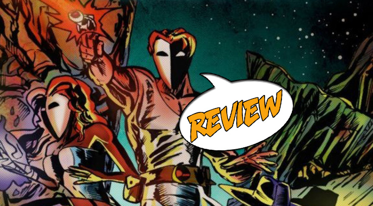
The highly stylized anatomy leads to considerable confusion, especially with Boots and Heels wearing identical masks.
Just as troubling is the layout of the pages. The dialogue is poorly spaced, making it difficult to discern who is speaking at some points, and completely covering large sections of the panels at others. Entire spreads lose their context when the dialogue covers the already difficult to understand background. The halfway point in the issue also contains a two page spread rich with a full vertical background, walls of mostly unnecessary text, and poorly laid out dialogue bubbles. While the retro feel of the art is still funky and enjoyable, it’s completely bogged down by the coloring and layout.
BOTTOM LINE
The premise here is solid– traveling back in time to save a superhero and fight mysterious villain—but the execution really holds the piece back. Kitschy dialogue, poor layouts and difficult to follow art keeps me from enjoying this issue the way I was hoping to. Overall, I’d give Boots Heels Claws a 2/5 stars.


1 Comment
Awesome lol….Also, I grew up in the 80’s…