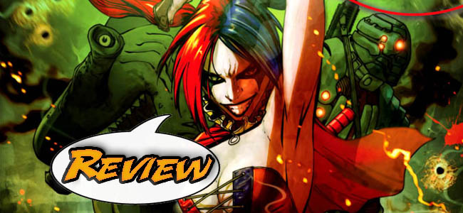
DC Comic’s team of nasties and ne’er-do-wells returns with Suicide Squad #1. Will this relaunch accomplish its mission or will it make readers want to… um, yeah…
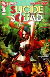 SUICIDE SQUAD #1
Writer: Adam Glass
Artists: Federico Dallocchio & Ransom Getty & Scott Hanna
Colorist: Val Staples
Letterer: Jared K. Fletcher
Assistant Editor: Sean Mackiewicz
Editor: Pat McCallum
Publisher: DC Comics
Cover Price: $2.99
Previously, on Suicide Squad: Gail Simone’s run on Secret Six was one of the best in (my) recent comics memory. Its replacement in the new DCU is the Suicide Squad, which reintroduces the concept of a government superteam made of supervillains, willing to risk death for a chance to get out of prison.
BAD GUYS DOING BAD THINGS
To me, Secret Six is the greatest casualty of the Great DC Reboot and so its spiritual successor Suicide Squad engenders some bittersweet feelings. It is unfair to compare it to its antecedent, but somewhat impossible not to. Luckily, Adam Glass has written an issue that is violent, funny and a proper number one. Glass introduces the main characters (via brief flashbacks), explains the concept clearly and does an expert job in setting the tone for the series. The exposition is delivered naturally through dialogue, and everything is explained comprehensibly for new readers.
In regards to the tone, make no mistake, this is going to be a brutal book. From issue’s beginning to end, horrible things happen. The first page features rats attempting to nibble through Deadshot’s midsection, and various other tortures are committed upon Harley Quinn, El Diablo, King Shark, Black Spider, Voltaic and Savant throughout. Arms are bitten off, ants crawl on faces, families are set on fire. Glass makes it clear that this is going to be an ugly book about brutal people doing brutal things. And for a series called Suicide Squad, that’s appropriate. The narrative really got under my skin like a good horror film, and the ending was suitably freaky enough to sign me up for the next issue. It could be too rough for some people (it makes Marvel’s Thunderbolts look like pussycats) but if you’ve got a strong stomach, you’ll be fine.
JUST PICK ONE AND STICK WITH IT
Much virtual ink has been spilled regarding some of the questionable character design choices (e.g. skanky Harley Quinn, hammerhead King Shark, skinny and sexualized Amanda Waller), but none of those topics trouble me as much as this issue’s frustrating inconsistency in overall artwork. As you can see, no less than three artists are credited on this issue, and believe me, it shows. It wouldn’t be so bad if one artist worked on the flashback sections while another did the modern day work, but no such division exists. Some of the art is great and shadowy, some of it is bad and rubbery, but the fluctuation between the two styles is the greatest sin. It’s jarring. This issue has been planned for quite some time – did they have to use a fill-in artist or is this just bad choice? It really hurts the quality and officially bummed me out.
CHECK IT OUT
This is one of my favorite books to come out of the DC relaunch, but it definitely isn’t for everyone. If I didn’t make it clear enough, this book is mean, but it happens to be my kind of mean. It is also one of the best of DC’s number ones at making clear just what it is doing right out of the gate. There isn’t any questions about what is or isn’t in continuity, and the ending literally drops the team into the action in classic cliffhanger fashion. Unfortunately, the shenanigans on art left a sour taste in my mouth, making what could have been a stunning debut merely really good. Four stars out of five.



34 Comments
I have to say that I kind of like the changes in character (up to a point) and while I appreciate that costume changes were part of the game plan, Deadshot looks ridiculous. And since this is pretty clearly Harley’s show, I’m not sure why they’ve transformed her into “Whorey Quinn.”
Well, actually I AM sure, I just don’t know that I like it. I will give this book a chance, based on it’s general meanness and ill temper, as well as the fact that King Shark (whose hammerhead redesign finally distinguishes him from Green Lantern villain The Shark), Harley and Deadshot are on board. And as much as I question the redesign of Amanda, I do love me some Angela Bassett.
What do you think is wrong with Deadshot’s look?
I do think King Shark’s redesign comes off the best.
What do you think is wrong with Deadshot’s look?
Deadshot’s Marshall Rogers looks with the featureless silver mask and sleek red suit has been replaced with a banded and armored monstrosity (the SECOND such revamp in the last few years.) His segmented helmet looks pretty silly, and except for his sighting eyepiece, there’s nothing here that says Deadshot to me. I know it’s a new reality, but Floyd’s new costume has a bad case of 1993 going on. It should be noted that mileage varies on this sort of thing.
Deadshot’s costume looks just like the one in Batman: Gotham Knight, the anime you guys reviewed some months ago.
Deadshot’s costume looks just like the one in Batman: Gotham Knight, the anime you guys reviewed some months ago.
“You guys” must refer to Rodrigo and Stephen, for I know not of this thing of which you speak. And the costume is just as ugly knowing that it’s an adaptation. :)
It was a good enough issue, I don’t see why so many people are having so many issues with Harley Quinn new costume, but I do find what they made with Amanda Waller unforgivable.
I don’t see why so many people are having so many issues with Harley Quinn’s new costume…
Because Harley went from a whimsical, full-body unitard costume and a fun sort of jester vibe to half-naked dominatrix cheerleader-with-a-gun. It’s not a bad costume, by any means, but it’s a pretty big change from what she used to wear, tight-fitting or no…
True enough, but to me looks more like an improvised costume rather than a permanent one, nothing keeps her from changing back or changing into something completely diferent in the future story arcs, besides it seems kind of fitting with her new psychotic demeanor.
“It’s not a bad costume, by any means”
I agree… Although it feels like it should be a new character… Or perhaps maybe one of those lame Wildstorm characters that they’re shoving into an already cramped universe…
Hah! Now ye young whippersnappers know what it’s like to have a character you grew up with changed and perverted!
Hah! Now ye young whippersnappers know what it’s like to have a character you grew up with changed and perverted!
Um… Apparently, we haven’t met. My name’s Matthew. I’m the old guy around here. :)
Also, I wouldn’t use the term ‘Perverted’ in the context of a sociopath dressed like disco bondage hooker clown Barbie.
I’m 64, and you … ?
Oddly, though I favor likeable heroes with decent morals, I find I enjoyed this book. It doesn’t pretend to be anything other than bad guys doing dirty deeds (unlike SAVAGE HAWKMAN and others where we’re ostensibly supposed to admire brutal killers), and Harley’s demented humor makes it twisted fun. Her “sinuses” line reminds me of the scene in BIRDS OF PREY where The Joker is taken on a nightmarish psychic ride through his own deepest fears and comes up grinning “Again! Again!”
I’m 64, and you … ?
I remember Gerald Ford, but not much of Nixon. :)
Amanda Waller no longer being The Wall, physically, irks me to no end.
Also Deadshot’s costume is ridiculous and stupid looking.
I have to say, that that last image pretty much killed this series for me. I mean, I know it’s petty, but Waller having a body type that was so atypical in the underwear model world that is comic books was part of the charm.
keep in mind…they never use the name “amanda” she is only referred to as Waller…is it her…is it a family member? With a stated purpose of added diversity it wouldn’t make much sense to retconn “the Wall” in this way, but time will tell.
Harlequin costume Harley would fit in even less than Arkham City-ish style Harley does in a “covert action team” I was “meh” on the change, I felt the nerd rage was overblown. Honestly, if you go back over the book and look at any of the art of Harley where she is focused on from the shoulders up, her face and expressions are extremely well done.
Okay you do make a good point. However, Harley’s costume just doesn’t even make sense to me in a theme, the old one did evoke a harlequin, this not so much.
I like Harley’s new costume. DC has brought her out of her playful self into a more serious tone I think. The punk rocker/school-girl look fits well and makes her look dangerous; especially with the sledgehammer.
Did anyone else LOL at her facial expression when she told her teammates that the person they had just shot was a dummy?
The guy with the gun to the back of Deadshot’s head asked him to give up Amanda Waller, so they did refer to her as Amanda, or at least that guy working for Waller did.
Maybe they did it to distinguish her from Mrs Fredericks on WAREHOUSE 13?
Issue 1: Torture Porn with the promise of mass murder in issue 2. With so much promise elsewhere in the re****, expect this book to live up to its title.
Totally agree. This is easily the worst book of the relaunch. Absolute crap. This would have earned 0 stars from me.
I think we have pretty divergent tastes in comics, Mike.
I think we have pretty divergent tastes in comics, Mike.
And that’s why Major Spoilers exists. Divergent tastes are what they is, and reasonable discussions can thus occur.
Albeit usually without the words “absolute crap.” :D
What makes this book so terrible? The art was good, if a little jarring for George. I quite liked the story and look forward to more to come. I didn’t really feel it had much to the torture porn aspect, at least not in a Hostel kind of way, I mean we’ve seen sensory deprivation/starvation/sleep deprivation and all that kind of stuff in movies (like The Recruit) as means of trying to break people to see if they can hack it in the CIA or wherever, it’s not super original but it works as a plot point, especially since you’re dealing with criminals who have no real reason to have any loyalty to you and you’re unleashing murderers into the world.
I take no offense to you disliking the comic, I had nothing to do with it’s creation, I just wondered since it was such a definite statement of being the worst and absolute crap and all that, without explaining why you felt that way. I hate Rob Liefeld’s art and I don’t think I could read even the best author if he was doing the art and even I wouldn’t give Hawk and Dove 0 stars.
Darkly interesting. I miss Catman but I’m in.
Yeah, me too. Catman was boss.
Deadshot (and Deathstroke) had very simple costumes with clean lines and good use of color. The redesigns just made them overly busy and ugly.
Love the new King Shark.
I like the new Hooker-Quinn look, but the hammer is just silly. There is no way she could wield that the way she is pictured to unless she had enhanced strength or it is made out of foam rubber.
really liked this untill I got to the last page. Its a shame what they did with Waller, not every female character in a comic has to be a 10, its boring really. Although Im sure they did it to match the GL movie, it was 1 of the things I really didnt like about the GL movie as well. Im still going to read it just dont understand why they do stupid stuff like this.
I do find the Amanda Waller change to be the most distasteful of the new character designs, but I’m willing to shrug my shoulders and press on. I think the Big 2 are prone to making tineared decisions like that.
The fan outcry is encouraging and goes against the ‘drooling fanboy’ stereotype pushed so often. Not everyone wants everything totally sexualized.
Yes, but if Amanda has a younger sister who was a 10 we’d all be fine with it. lol. I thought it was a bit of corporate synergy there too, fitting her to look a bit more like Angela Basset, although I think the comic version looks better than the live version of Angela that was shown in Green Lantern, that hair was terrible!
When it comes to the art and the three different art styles being jarring, I didn’t have that problem really, but from my examinations, it does feel like there’s a specific pattern for the art. You suggested that it would have been okay if there was one artist doing flashbacks and one on real time. From what I could see, it seemed like all the flashbacks were done by one artist in the same particular style, the scenes where they’re being tortured all look to be done by another artist and then the third style kicks in after they’ve been knocked out and wake up with all their gear back on and it’s revealed to them that they passed their test. There’s probably a good reason for this breakdown. These are three separate sections to this story, the first being what got them thrown into Belle Reve (somehow they were allowed to keep all their gear while incarcerated), the current predicament they’re in, and the future that lies before them. I felt that way at least, but that’s just how I view the book.
This is a book I’ll definitely keep reading. Waller is clearly supposed to look like the GL movie character (which is dumb. That should be the other way round.)
As I’ve never read much Deadshot, I never clearly understood why he needed that excessive costume. What does it do?
I want you all to know that the artist on this, fredericco, previously worked on an indie that I have been following since a few years ago at comic con. one of the main characters is nothing less than…. a hammer head shark, the shark was in existence before the issue or two that he drew. how uncanny. hmmmmmmmmm.
you can check it out at the hard bullied comics page at graphic.ly