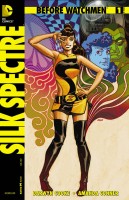
Or – “My Favorite Watchmen Character…”

Laurie Juspeczyk is a problematic character. She’s foul-mouthed, short-tempered, inappropriate, and highly flawed. In short, she’s the everyman glue that holds the extraordinary sorts of Watchmen together. While her story is reliant upon the other cast-members, the primary characters of the book become reliant upon her as well. Can the incredibly talented team of Conner & Cooke get her right?
 BEFORE WATCHMEN: SILK SPECTRE #1
Writer(s): Darwyn Cooke & Amanda Conner
Artist: Amanda Conner
Cover Artist(s): Dave Johnson/Jim Lee w/ Scott Williams & Alex Sinclair
Colorist: Paul Mounts
Letterer: Carlos M. Mangual
Editor: Mark Chiarello
Publisher: DC Comics
Cover Price: $3.99
Previously, in Before Watchmen – Silk Spectre #1: An old aphorism says that you can’t choose your family. For the Silk Spectre, this seems a particular disservice, as her family consists of a stage-mother who wants her to follow in her footsteps and a step-father who seems more business manager than husband. Nobody’s teenage years are easy, but Laurie’s have the makings of an utter nightmare…
UTTERLY ADORABLE…
There are a lot of people (*coughstephencough*) who love the work of Amanda Conner on attractive grown-up women, but this issue opens with a sequence of young Laurel Jane and Sally that is simply heart-breaking. Like Minutemen #1, this issue breaks the nine-panel grid that Watchmen used, but it keeps a three-tiered page throughout, emulating the original while giving the art a more expansive feel. Connor’s young Laurie is super-cute, and as the character ages, the art continues to keep Laurie cute as a button. By 1966, a teenaged Laurie is dealing with crushes, bullies and other high-school ephemera while training day after day for the masked mysteryman career her mother insists she work towards. This is a much more straight-forward story than Minutemen as well (which makes sense, given its single protagonist) giving us snippets of Laurie’s life, including one horrifying sequence showing how far Sally will go to try and make her daughter over in her own image. The creators nail the tone and visuals throughout the issue, including at least one panel that echoes the later death of Edward Blake, which resonates on multiple levels.
WORDS AND PICTURES IN CONCERT…
The most wonderful part of the story comes in how successfully it portrays a female protagonist, with Laurie feeling very authentic throughout the book, as we see her first cigarette, her first kiss, the first time she punched the $#!+ out of someone who richly deserves it. It’s a nicely done issue, and the team of Darwyn Cooke and Amanda Conner are seamless in how they tell the story, down to the use of background music/television narration as part of the experience, similar to the original story. I like Laurie’s story, and the seeds of the character she will become in this story, and the ending sets her off on what is probably her first solo adventure in a very Velma Dinkley sort of way. There’s another chapter of The Crimson Corsair here as well, expanding on last issue’s story, but where last issue had a natural climax, this portion of the story feeling somehow rushed. I’m still reserving judgement on the Corsair until I have enough story to work with, but the art, at least, is interesting.
THE VERDICT: A SECOND SUCCESSFUL PREQUEL.
For all my worries about the Before Watchmen project, we’re two issues in with two decent reading experiences under our belts. The fact that both issues feature a measure of Darwyn Cooke probably has a lot to do with that, but this issue is a nice reading experience, if completely unlike Minutemen #1. From an art perspective, it’s an amazing experience, and it’s truly nice to see younger versions of Sally and Laurie that LOOK like younger versions of the characters as drawn by Dave Gibbons, and the story is personal and painful as high-school drama always is. Before Watchmen: Silk Spectre #1 does its main character justice, reads well, and looks gorgeous, earning 4.5 out of 5 stars overall. I don’t know how long they can keep this kind of quality up, but I’m enjoying the ride while they do…


3 Comments
I particularly liked how the 9-panel grid was used and broken creatively; every time it was broken, it was done so in a way that still preserved that 9-panel layout. I liked that template-style better than the panels in Minutemen #1
Agreed! I love the three tier page.
I wish more modern books used it.
Absolutely agree. A thoroughly enjoyable issue!