![]()
If you were waiting to see how the new DC logo would look, and how it would be used, DC Entertainment has all the details… after the jump.
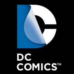
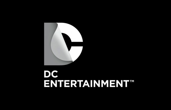
DC Entertainment, a Warner Bros. Entertainment company and home to iconic brands DC Comics, Vertigo and MAD, revealed today a new brand identity. The new identity is reflective of the company’s mission to fully realize the value of a rich portfolio of brands, stories and characters, distinguished by incredible breadth and depth across publishing, media and merchandise. A new logo for DC Comics was also introduced, closely aligning with DC Entertainment’s new mark.
“It’s a new era at DC Entertainment and the new look reflects a dynamic, bold approach while at the same time celebrates the company’s rich heritage and robust portfolio of characters,” stated John Rood, EVP of Sales, Marketing and Business Development for DC Entertainment. “It was just a few months ago that Superman, Batman and many of our other Super Heroes were updated when we launched DC Comics – The New 52 and now it’s time to do the same for the company’s identity while remaining true to the power of storytelling which is still at the heart of DC Entertainment.”
DC Entertainment worked with Landor Associates, one of the world’s leading brand consulting and design firms, to develop an identity that creates a visual connection among the company, its three brands DC Comics, Vertigo and MAD and its vast array of properties as well as celebrates the power of the company’s stories and characters. The design of the new DC Entertainment identity uses a “peel” effect – the D is strategically placed over the C with the upper right-hand portion of the D peeling back to unveil the hidden C – symbolizing the duality of the iconic characters that are present within DC Entertainment’s portfolio.
“It was our goal to capture DC Entertainment in a dynamic and provocative identity. Our solution is a living expression which changes and adapts to the characters, story lines and the ways fans are consuming content,” explains Nicolas Aparicio, Executive Creative Director at Landor’s San Francisco office. “The new identity is built for the digital age, and can easily be animated and customized to take full advantage of the interactivity offered across all media platforms.”
The new brand identity will come to life across all consumer touch points in order to create a clear and consistent message in support of DC Entertainment. The new identity will begin to appear on comic books and graphic novels as well as new websites in March. Consumers will also see the new identity rolled out over time on other DC Entertainment products from Warner Bros. including film, television, interactive games and merchandise.
“We believe our new brand identity will strongly resonate with our loyal fans who will want to proudly express their affinity for DC Entertainment and their passion for their favorite stories and characters, this new look allows them to easily do this. In addition we were excited to update our identity, it’s not often a company gets to revisit something as important as its brand and we took the opportunity to make sure it represented the multi-media business we set out to build with the formation of DC Entertainment,” said Amit Desai, SVP of Franchise Management for DC Entertainment.
I gotta say that as the week as progressed since my first initial viewing of the logo, that this has really grown on me, and now that I see it in action, I really like it a lot. It is a nice mix of traditional, and forward thinking. And if I wanted to throw in another buzz word, there’s a lot of synergy behind what DC Entertainment is doing to bring everything together.


20 Comments
After seeing the different designs the logo can take and how they are placing it on the books… I hate it less than I did when they first announced the logo change… I still like the current logo though… so whatevs
I simply don’t understand all of the nerd rage over the new logo, but I suppose nerd rage isn’t something to be understood anyway. Personally, I really like the new logo design. It’s a nice, simple design, although the ‘sticker peel’ adverts don’t really strike my fancy. Now that we’ve seen just how DC intends to use the new logo, I hope some of the nerd rage will subside.
I know, right? I get getting angry over retconning a character or cancelling a book, but changing a logo?
I blame chastity.
In context, I confess, I like it better.
Even “in action” it’s still kinda blah to me. It strikes me as fitting a “boring” company (like an accounting firm or management consultants). I don’t want my DC to be boring. And even though I appreciate how they’ve “Green Lanterned” the logo, and Batman’d it, and Cyborg’d it, and all those other tweaks… It’s just gravy on otherwise visually bland potatoes, and I’m not even “nerdraging” about it. This is no “Nike swoosh” type of brilliant rebranding. It’s just a C with a cape/peelback and some text. Welcome to DC Legal. Woo. Did the latest “new DC” logo drive people away in droves? This seems to be a case of fixing what ain’t in need of fixing, and I think “we” can agree they could better spend their efforts elsewhere?
I don’t remember if I’ve mentioned it on the site, but I know I have on the podcast… DC lost a trademark lawsuit to DC Shoes, and were paying them a fee to use the swirly logo. So while fans may not have been fleeing in droves… money from DC Comics was flowing to DC Shoes.
Ahhh… See, that puts it in a whole new light: the light of Desperation. Which lantern corps is that one?
Chartreuse.
It’s even more hilarious when you consider that the whole fiasco with DC shoes began when DC comics sued them for trademark violation. The shoe company discovered that after DC comics changed their logo from the old bullet, they didn’t properly trademark the new one, so the shoe company turned and sued the comic.
I’m thinking of how this will look with a bunch of trades sitting with the spine out and multicolored DC logos. I think it will be pretty cool. But I was wrong about the D popping once they added color. It’s hard to see the D in the logo. The C pops though.
Giant corporation designs Watchmen DC logo. Yeah!!!!! Mark it up!
I can’t tell what the black rubber hose one is supposed to be.
What’s the top right one supposed to be? Superman?
Otherwise, yeah now I’m starting to dig it. Though I wonder if I’ll see the Watchmen one, on my copy of say Supergirl.
Where the hell is the D?
I think it looks like crap. Sometimes those marketing gurus can sound smart in the board room but the result is just…whatever.
Oh come on. You can’t TELL me that thing doesn’t look cool. It’s awesome. Now, they mentioned it being on MAD and Vertigo… I want to see that treatment.
I like it. It’s not like DC pulled the big boner the way Pepsi did when they wanted to market a one calorie version of Pepsi. They hired the biggest advertising names in the business and went two million dollars over budget, and a year past due, and the best the brightest names in the business came up with was the name “Pepsi One”. Jeez, they could have just given me the two million, and I could have saved them two years worth of work and come up with that one in ten seconds. And ANY logo is better than the old DC logo with the circle and stars and the angled DC in the center that they used in the 70s.
Great concept. Sophisticated execution. That is the essence of good design. Kudos to DC for a logo that will server them well over multiple media.
correct me if i’m wrong, but for the the core DC titles are seperated into 6 different groups. So the one that looks red and yellow with some smoke or something could be for the flash titles. The black one w/ coils around it more than likely for batman books. Glowing green can only be for the lantern titles. the first one could poss be steel for the Superman books. It could be their intention that if you like Green Lantern you will look for other DC books that have a green day glo logo on them and pick them up. What if the general non comic reading public never understand the purpose to that type of logo design. Is DC going to explain it in everyone of their books!
While I do think the number of ways the logo can be “personalized” to fit whatever character/property it’s going on, I think the peeled-back-“D” is lost on the viewer until it’s pointed out causing the need for “DC Comics” to be placed underneath (and looking kinda odd with “DC” over “Comics” thus breaking up the rectangularness of the block; and don’t get me started on how “DC Entertainment” looks).
Has DC ever won a legal fight? I’m honestly curious as I cannot think of a single one.
Has DC ever won a legal fight? I’m honestly curious as I cannot think of a single one.
They put the smackdown on imitators (including Victor Fox’s Wonder Man) as early as the 1940s.
They sued Fawcett Comics completely out of existence in the 50s…
There’s evidence that they shut down M.F. Publications’ use of a character called “The Bat” in the 1960s…
They shut down the guy making bootleg Batmobiles…
They shut down the production company making the porn film “Superwoman…”
They shut down the guy making “reproduction figurines” of actors in costumes related to the old Batman TV show…
The Superman lawsuit is still ongoing, so they haven’t lost that’n yet.
I’d say their track record is better than you might recall. :)