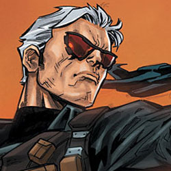
The Blackhawks are back, working for the UN by blowing stuff up. Do these pilots have the right stuff or does Blackhawks #1 lay a big fat egg?
 BLACKHAWKS #1
Writer: Mike Costa
Layouts: Graham Nolan
Finisher & Cover: Ken Lashley
Colorist: Guy Major
Letterer: Rob Leigh
Associate Editor: Janelle Asselin
Editor: Mike Marts
Publisher: DC Comics
Price: $2.99
Previously, in the world of DC Comics: The Blackhawks were a multiethnic squadron of Allied fighter pilots in World War Two. Their token female member jumped forward in time to join the Birds of Prey, prior to the reboot. Now, they work for the United Nations and collect VTOL aircraft.
QUIT PUTTING IDENTIFYING MILITARY INSIGNIA ON YOUR BLACK OPS HARDWARE
Blackhawks #1 is akin to a Michael Bay movie – big explosions, flashy action and concepts that don’t hold up to the slightest scrutiny (such as a super-secret UN task force putting logos on their choppers). This issue opens in the middle of a hostage-rescue scenario, in which the Blackhawks mandate to keep covert is blown up along with most of the scenery. This is followed with a tour of the Blackhawks’ base, in which a UN delegate is instructed in how nicknames work, some exposition is delivered, and an inter-Blackhawks romantic liaison goes wonky due to a rogue plot hook.
It is hard for me to write a review of an issue like this. It didn’t inspire either positive or negative feelings. In relation to DC Comic’s other military book, Men of War, this is less gritty and more like, well… GI Joe, which Mike Costa is currently writing. I have heard good things about Mike Costa’s work on GI Joe: Cobra, but nothing in this issue popped out at me. The introductions to the characters felt incomplete beyond “here is a stock nickname” and the plot hook was predictable. The one carry-over character, Lady Blackhawk, isn’t present in this issue, and none of the other characters were distinct or particularly interesting. The action was good and the main threat is coherent, but the material is never elevated above merely serviceable.
IT LOOKS LIKE IT READS
Graham Nolan and Ken Lashley do a fine job on art. The action is dynamic, the backgrounds are detailed and everything is rather functional. It’s not the most distinctive work, but the only real negatives are that it looks a little too slick and the linework is too busy at times. Otherwise, the artists get the job done. There’s one error with the lettering that was annoying, but that aside, it all works.
NON-ESSENTIAL PERSONNEL
Blackhawks #1 did not inspire me, but as always at Major Spoilers, your mileage may vary. This is a big loud action film of an issue, and if that’s what gets you going, this should be a perfectly entertaining book worth your $2.99. Unfortunately, I felt no connection to any of the characters and the plot did not hook me with anything original. The ephemeral nature of Blackhawks #1 earns a middle-of-the-road two and a half out of five stars.


2 Comments
I noticed that on one of the first pages, there is an electronic world map, and that map shows a post Atlantean-flooded Europe. I assumed that after Flashpoint ended and Barry Allen returned to the current stream of things (albeit slightly changed), the whole Atlantean-Amazon war and Europe underwater thingy wasn’t part of the current/new DC universe, so to speak, and that it was something that kind of happened/didn’t happen. Now I’m wondering…
Didn’t much care for this book. They do have a bit more of that variation in the uniform thing, like G.I. Joe, which if they ever really give us anything more on the characters it’ll make them easier to peg unlike in Men of War. I thought the art was a little distracting actually, not really bad or anything, but maybe like you were saying with the linework being too busy, it just felt like everything had too many lines on it. I had to look at some of the enemies masks a little longer because they were so marked up it obscured some of the details.