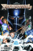
Here at Major Spoilers, we like to take some time to look at the lesser known books. The smaller stuff that might slip by unnoticed by the average comic reader. This week I take a look at Xenoglyphs from OSSM Comics. Is it worth picking up? Your Major Spoilers review has the answer!
 XENOGLYPHS #1
Story: Omar Spahi
Art: P. J. Catacutan
Publisher: OSSM Comics
Cover Price: $3.99
AN ALIEN STORY
There are a lot of things wrong with Xenoglyphs #1. The story is just cliche after cliche. There are magical stones that let the wielders control the elements, and of course the one who collects all of these stones gains ultimate power. They even throw in a prophecy of an ultimate good guy who is going to defeat the ultimate bad guy. The characterization is laughable too. I literally cannot tell you any defining traits of the main characters outside of very broad cliches like “hacker.” The villain executes his followers when they fail him in a fashion that just screams “trying too hard” from the writer. The plotting is awkward, and awfully paced. There is exposition everywhere, with characters telling other characters exactly what their goal is and what they need to do to accomplish it. The dialogue was cringe worthy throughout, everything from the over used “bro” to the corny as hell flirting between the lead and the only female character had me wincing because it was just all so dreadful.
EVEN MORE ALIENATING ART
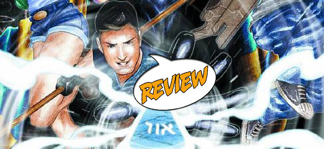
The art is not much better than the story, unfortunately. The coloring makes everything kind of blend together, which just makes the main characters feel insignificant. The line work is seriously lacking. The cliche character design would not be so bad if the character’s proportions could stay constant throughout the book. there is also some really weird choice in panels. Like there are times where they choose to show a single action happening over the course of three panels, and then they completely skip an action between two panels, but the action could not have possibly happened between the two panels we see because of how the characters are placed. There are a few moments of quality work though. Specifically when the the big bad shoots his gun, and when the protagonist’s reflection is seen in the glasses of his “hacker” friend. Those two panels were actually very well done. Overall, though, the art just feels unprofessional.
BOTTOM LINE: SKIP IT
This comic is really not worth reading, let alone buying for four dollars. If anything, tell people to avoid this comic. I try to give some leeway to the smaller comics because they do not have the same kind of staff backing them that the big two have, but this was so bad that I want the ten minutes I took reading it back.
DID YOU READ THIS ISSUE? RATE IT!
Reader Rating
[ratings]


