![]()
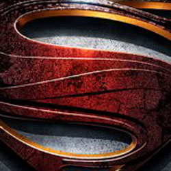
Those following the Man of Steel facebook page got a surprise late last week when Warner Bros. revealed the new logo for upcoming movie.
It’s a bit of a modern take on the logo, and considering the legal issues DC Comics continues to have with the property, the logo change makes sense. And, it really doesn’t look that bad.


4 Comments
It almost looks like there’s a Nike swoosh in there… Cross-promotion anyone?
Hate it.
Die, NuDCU!
Not going to see “Man of Steel” until it hits the dollar show.
The little serif dealy on the end of the S looks odd to me. But other than that I can’t say I hate this logo.
Thing with me is that while I like Superman because he stands for a lot of things I do, I don’t often have an interest in reading about him or seeing his movies. He’s kinda boring to me most of the time, especially when he’s in the upper tiers of his power. So I don’t have much of an interest in this film. Here’s hoping it’s decent. DC needs more good, non-Batman superhero films.
But if this has Lex Luthor as the villain, again, then I quit.
DC owns the Superman shield logo free and clear in all markets and into perpetuity so long as they keep on using it as a trademark and- as a rule- there’s not really enough substance in the logo to run into copyright infringement… and even if they did, the heirs would only own the very specific Action Comics #1 Superman logo, not any of the stylized derivatives thereafter.
So basically, changing up the logo has no legal effect thus was not likely motivated by legal troubles.
That said, you can make a policy argument- one that DC has been making- that Superman grows, changes, and evolves over the years and that DC is the source and owner of those changes, not the heirs… so change for arguments’ sake… is a possibility, but frankly I think it’s just a creative choice to reboot / refresh / reintroduce Superman. Just like Amazing Spider-Man’s logo needlessly changing except to set it apart from Raimi’s films (or Batman’s look in successive films).
Returns took way too much for granted and acted like the audience owed it deference, nostalgia, and exactly the right amount of prior movie knowledge (enough to make Returns sensible but not so much as to render it contradictory), and despite the updates, it relied heavily on the boon and baggage of a Williams score and Christopher Reeve lookalike.
Like the comic run, Man Of Steel, instead of assuming understanding and adoration, the film should seek to earn it even if it means change ups (like Byrne did to the mythos), no matter how much it gets my outside-the-tights trunks in a bunch. I tend to think things like costumes and logos to be pretty superficial cosmetic indications of an update… but hope the spirit carries through to the actual story in a way that is successful (at least moreso than the mixed reaction to other changes).