![]()
Here we are with the last of the three new titles to come out of the partnership between Stan Lee and BOOM! Studios. The first two – Soldier Zero and The Traveller – have been reviewed pretty favourably on this very site, so how will Starborn #1 fare? Find out after the jump!
 Starborn #1
‘Grand Poobah’: Stan Lee
Writer: Chris Roberson
Art: Khary Randolph
Colours: Mitch Gerads
Letters: Ed Dukeshire
Editor: Bryce Carlson
Covers: Gene Ha with Nei Ruffino (Cover A), Humberto Ramos with Edgar Delagado (Cover B), Khary Randolph with Etienne St Laurent (Cover C)
Published by BOOM! Studios
A Galaxy No Longer Far Away
Our story concerns one Benjamin Warner, an aspiring writer who is, for the time being, stuck in a soulless job that involves a lot of spreadsheets. As we meet him, he is eagerly awaiting the response of a publisher, to whom he sent the manuscript of his first book, a space opera about the space-faring ‘Human Civilisation’ battling The Hive – once-humans, now transformed into beings of a single mind. Benjamin is crushed, however, to find that the publisher has rejected his novel, and goes to work that day depressed. Events take a turn for the bizarre, however, as Benjamin finds himself under attack from his co-workers, transformed into beings that look strangely like members of The Hive! He is saved just in time by his childhood friend Tara Takamoto, who is also acting like a character out of his book. Our issue ends as the pair jump off the roof of Benjamin’s building to escape the attacking Hive.
I find my reactions to this book to be curiously mixed: on the one hand, the plot isn’t all that original. Fantasy invades reality, basically, an old chestnut we’ve seen numerous times before. However, I only really reached that conclusion upon reflection, after having finished the book, as whilst I was reading it I was far too busy enjoying it to worry. This book is very well-done, from the writing to the art everything has a real professional feel to it, and the entire piece reads and looks like a lot of effort has gone into it.
So, yes, I did very much enjoy this book. I enjoyed how the first few pages are actually an extract from Benjamin’s book, and how that book is wonderfully clichéd and this is used to play with the audience’s expectations. I enjoyed how Benjamin is a character with whom it is very easy to sympathise (especially if, like me, you’ve just completed NaNoWriMo), and how one can genuinely feel sorry for him when his book gets rejected, even though we’ve only known him for a short while. The strange thing is, I feel like I should be picking more holes in the book; that I should, perhaps, mention that there is quite a lot of exposition by way of internal monologue, or something like that. But anything I can think of to mention in this area, on reflection, isn’t really anything like a problem. The whole thing works – if any one of these elements was a touch out of place I have a feeling that the book might collapse, but they are all there precisely as they are needed, and the book, quite simply, works.
Well, there is one thing that feels a bit out of place – when Benjamin is accosted by one of his co-workers-turned-Hive-member for the first time, we suddenly break in to about three panels of exposition, which really breaks the flow of the scene a bit. That felt like it could have been placed elsewhere, or even left out entirely, and that is my only real complaint with this book on the writing side.
A Universe Beautifully Rendered
The art looks brilliant – from alien vistas to a hum-drum office, Randolph really serves up a visual treat in this book. Everything has a vibrancy to it, which is very much helped by the colouring, which ensures that the book always looks bright and has a real life to it. I love the style that Randolph has gone for with this book, one that does not strive for photo-realism but instead presents art that is obviously illustrated without being stylised in a manner that might put you off. I also enjoyed the manner in which the flashback scenes were presented – looking washed-out in colour apart from the colour blue, which no doubt has a fair amount of significance.
The art, however, does feel a bit disjointed in the action scenes towards the end, and for a couple of pages it can be difficult to determine what exactly happens from one panel to another, or what specifically is going on. The art does work fine on another action page, though, so time will only tell if this will become a long-term problem for the series.
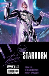
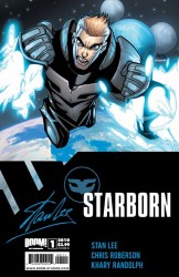
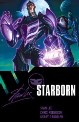
Our three covers all feature Benjamin in what I can only assume is his ‘Starborn costume’ in various poses (with Cover C also featuring Tara). I say I can only assume this because, of course, we never see him in this costume in this issue, and so all three of these covers loose major points with me for not really having any relation to the contents of the issue. They all feature our character (or characters) in generic poses as well, and so don’t win any favours for their complexity or ability to provoke thought. They are all well-drawn to varying degrees, even though in Cover B Benjamin looks like he has no legs. I especially like Cover C by Randolph, for the Starborn costume design. Oh yes, the costume looks different (by a small but significant amount) on each of the covers, which rather annoys me – you’d think for the first issue they’d make sure everyone knew what the costume looked like.
Definitely Worth a Look
Annoyances with the covers and minor problems aside, this really is a quality book. The writing and art both do great jobs and, most importantly, very much succeed in the task of making me want to pick up the next issue. This is a book you definitely want to be checking out, and I give it four stars out of five.



1 Comment
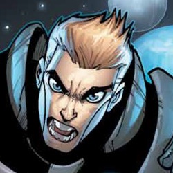
Is Benjamin really a Decepticon in human disguise? Seriously look at his chest piece. Looks like an organic version of a Decepticon emblem.