
Writer: Sterling Gates
Artist: Rob Liefeld
Colorist: Matt Yackey
Letterer: Dezi Sienty
Cover Artist: Rob Liefeld and HI-FI
Editor: Rachel Gluekstern
Publisher: DC Comics
Price: $2.99
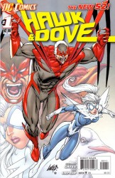
Previously in Hawk and Dove: Hank and Don Hall became the heroes Hawk and Dove, the avatars of War and Peace, respectively. Don died and was replaced by Dawn Granger. Hank went crazy, became a bad guy, and died to be replaced by Dawn’s sister Holly. Holly died during the Blackest Night and Hank was one of the people resurrected so as he and Dawn could be a focus for the Brightest Day, specifically for Dawn and Deadman to get together. Now with the relaunch, it’s still Hank and Dawn, but what have we kept and what have we lost?
DIVE INTO THE ACTION
So not quite immediately into the action, but close enough, right? We open with the “self proclaimed science terrorist” Alexander Quirk talking about how the government is corrupt and blah, blah, blah, send in the Monsters of Mass Destruction, (Yes, this does sound quite awesome) and this is part of a report announcing that no one knows where the plane he claimed to hijack is or if it even exists. Now we get to the fun, the plane exists (duh) and our heroes are in it (of course). We get an enjoyable fight scene showing off the questionable teamwork between the two that does a good job of implying the lack of trust Hawk has for Dove. Also, techno-zombies, cool. After the mostly reasonable landing (they only damaged the Washington monument, not destroy it) we start to meet supporting cast.
The first is a member of the D.C.P.D., Washi Watanabe, who mentions that the pair had worked with them previously. Unfortunately he is mostly dismissed by Dove and just growled at and hated by Hawk. The next we meet Hank’s father, who has something to do with law enforcement though it’s not made clear, who seems overly critical of Hank, though he does know of the whole hero business. The last we’re introduced to is Deadman, which is awesome. I had enjoyed the relationship creation between him and Dawn in Brightest Day and I’m glad it is one of the things that were carried over. While we meet these people we also get some background/origin stuff that barely explains some of the tension between the pair. Essentially, Dawn’s not telling Hank something and Hank misses his brother.
The final page is a bit of a reveal showing a new bad guy who is hunting our heroes, but that’s all we get, other than that he looks like Hawk after a swim in the sewers.
BACK TO THE 90’S
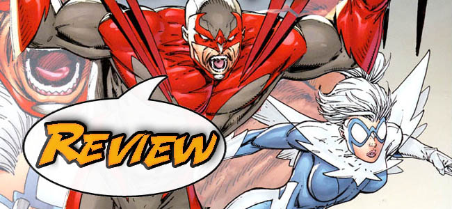
I rather dislike Liefeld’s art. After reading Blackest Night, Brightest Day, and Birds of Prey I was interested in seeing a Hawk and Dove ongoing. When they announced the book as part of the DCnU I was excited, until I saw the latter half of the creative team. And, unfortunately, my reservations were justified. The faces either look ridiculously flat or sharpened to a point. Half of the action poses are set up as though each body part is in a separate step of the move. I am honestly unsure as to what color Hank’s costume should be as it ranged through the entire gray-scale, completely from white to black. Hank’s eyes were also at least three different colors while out of costume. At least Dove wasn’t the busty Amazonian that I was half-expecting, though she seems a bit curvier than I recall, and it seemed like Liefeld never knew what to do with her hair as it is never in a similar position and always looks juxtaposed to where I expected it. One last thing, why does Hank always look constipated?
BOTTOM LINE: WAIT FOR ISSUE TWO
The writing was ok, with the characters feeling too simple as Hank went from angry to whiny and then back to angry while Dawn was simply passive and remote the entire time. I’m also not sure what elements are still pulled from the previous DCU as there is no mention of Hank’s death and resurrection, but Deadman and Dove are still dating, and this mostly confuses me. I guess I’ll take another look next month, but so far Hawk and Dove barely gets 2 out of 5 stars from me.
[rating:2/5]


32 Comments
Hands down I think they are the most ridiculous looking costumes in the DCU. Character idea? Fine. But, big as he is, I’d still laugh if he came for me.
The original Ditko designs are evident here, but NOBODY draws Ditko designs all that well ‘cept for Ditko. For all Rob’s artistic flaws, the uniforms aren’t his fault.
Then why did they need to keep Ditko’s designs? It is a new universe, after all.
I just cannot understand why Liefield keeps getting work. He seems like a nice enough guy from his levi’s commercial, but he shouldn’t be allowed to illustrate anymore. Maybe he should give inking a go?
I’m not going to defend his artwork because I don’t like it either, but to think he’d give up pencilling is silly– the guy has sold a ton of comics over the years.
Every artist comes to a point where they get sick of thier own work and try to redefine thier style, this usually leads to an evolution in thier skills and style. Not Liefield, he has no intentions of reinventing himself. He is the same now as he was back in 1988.
Google Liefield Captain America cover and you will get an image where Capt A. is standing with his shoulder to you and he is wearing his shield on his sleeve, you can see his back muscles on one side of the shield and his chest muscles on the other side which made him look like he had boobs.
He showed this to Jim Lee and Jim Lee told him that he needed to fix this and Liefield said, “Nah, its good.” and then printed it out, so even confronted with his illustrating problems he refuses to change because he is lazy. Now that cover is infamous.
These are the reasons I cant stand his art, he also needs a few college courses on anatomy and he has enough money to afford them. So long as people continue to buy his books then he will keep drawing the same.
He is the only artist who I refuse to buy thier books. My favorite book is the thunderbolts and I have every single issue. If it gets an artist I don’t like I still buy the book but if Liefield ever draws an issue of thunderbolts it will be the only issues of thunderbolts that I will not buy. Speak with your wallet.
Oh, God! I never saw that Cap cover. That is AMAZING.
Googling that brought me to the 40 worst Liefeld drawings. It is drop-dead funny. I was laughing far too loudly.
Yeah, I showed that site to my wife and while I laughed like an idiot, she just shook her head and walked away. She just doesn’t understand I guess. lol
Friend of mine showed me the same site. Everyone I showed it to laughed themselves silly.
Going off on Liefeld is like playing paintball with a heroin addict that just shot up: it’s too easy. Jim Lee must’ve went all in at a poker game against Liefeld and lost because I see no reason for him to be on one of their books.
Honestly, if Liefeld is going to draw anything, it should be Hawk and Dove.
Or Youngblood…
Or Kablamikus…
Hush your mouth!
Hey, i’m sure i have a mid 90’s platinum edition of Kablamikus #500 with art of Liefeld and story from frank miller
Hey, i’m sure i have a mid 90′s platinum edition of Kablamikus #500 with art of Liefeld and story from frank miller
That’s not a comic, that’s a Wizard insert talking about how they would relaunch the character, and it’s not really Liefeld, it’s Hank Kanalz aping Liefeld. Either way, the real Kablammakus fans don’t consider it canon, not even Buckminster Rhys Jones, who once tried to work the 1941 serial “Fist Behind Bars” into continuity…
Well, if Action comics is the ’30s, OMAC is the 70’s Kirby stuff, JLI is the 80’s, it makes sens DC would try to pay homage to the 90’s as well. Unfortunately, this is the part of the 90’s that isn’t that good. I’m slightly interested, but the next issue better grab me quick or I won’t be wasting my time.
Done! Now bring on next weeks issues! We spoilerites will be here to take them on.
It makes sense DC would try to pay homage to the 90′s as well.
I think maybe Static Shock did it better… Your mileage may vary, though.
Yeah, so did Stormwatch.
Static Shock was better than I thought it would be and I’m happy about that. Looking for Icon!
The new bad guy seems to be Kestrel from the Hawk and Dove relaunch series, also drawn by Liefield. Although truthfully, that mini was inked by Kiesel, and the art looked very good, so I guess credit goes to the inker, because Liefield’s art looked horrible in this issue. His weaknesses are very visible here -his trouble drawing fists and feet are readily apparent, his facial expressions are simple, and his faces all look similar – one would be hard pressed to be able to tell that Hank’s father was older but for the white color of his hair.
I’m at war with myself because I bought this junk but I’m at peace because I had pizza for dinner.
I probably should be giving Rob Liefeld more credit but sometimes I feel like he uses a template for all his characters and then just moves them around the scene like a ragdoll and then draws over with new costumes. That could be the reason why most of his characters have the same body proportions.
I’m surprised this got 2 out of 5.
what everyone else said.
Any mention of Lords of Order/Chaos?
Not directly.
Any mention of Lords of Order/Chaos?
Sort of. I think they called them “The Avatars of Peace And War”, but they were clearly T’Charr and Terataya (spelling may be optional.)
The art was not the worst I’ve seen. And I don’t like the red/gray of Hawk’s costume now as compared to the old red/white.
I was interested because I have been a fan of Hawk and Dove since they first appeared lo way back in the day. They were an especially interesting concept in the 60’s/70’s as personifications of the sides of the Vietnam War protests. (Not like there’s anything similar to that going on here in the 21rst Century). It was strange that there was no mention of the former Hawk since if Dawn and Boston Brand are still an item (I don’t want to know how that works…really…I don’t) then we have to assume that at least that part of Brightest Day and Crisis on Infinite Earths occurred.
With the appearance of Kestrel and apparently another female “bird-avatar” I guess we’ll get another look at the forces that empower Hank and Dawn. Alluding to a possible past relationship between Dawn and Don hall seems a bit forced and un-necessary to me in order to continue the “team in-fighting” between two people who represent as heroes the opposite ends of the spectrum. I would like to find out why, of all the heroes in the DCU, Don Hall seems to be the only person that STAYS dead and could not be raised as a Black Lantern.
I would like to find out why, of all the heroes in the DCU, Don Hall seems to be the only person that STAYS dead and could not be raised as a Black Lantern.
Don Hall at peace. Temba at rest. Darmok and Jelaad at Tanagra.
AT TANAGRA!!!!!! Don Hall At Tanagra With Picard? (In one of my university courses, we spent an entire class watching/analyzing that ST:TNG episode. It was awesome.) But to be semi-serious, of course the “avatar of peace” is resting in peace and cannot be raised. That actually made a lot of sense in an event where not lots of sense was made.
Yeah, I read this one out of curiosity, which is pretty much the only way I read Liefeld anymore. I look through it closely to pick out all the terrible anatomical innaccuracies and general laziness of drawing. The eye color thing had me laughing, I hadn’t noticed that his eyes go from a golden color to bright blue back to golden. I hate the basics of Liefeld, poorly drawn (or worse, obscured behind something) feet and hands, feathered hair, tons of teeth, constipated screaming faces, hair that behaves like it’s alive and never just lays on a person’s neck or shoulders but hangs in the air suspended upon it’s own power. Maybe Dove can use her flying powers on her hair alone because she likes having it float behind her. That and she’ll have turned her head to look at Hawk and the hair seems to have whipped the wrong way, but one panel later and she’s still looking back at Hawk and her hair will be laying across her opposite shoulder. It’s insanity. I actually like the idea of Hawk and Dove, but this is a little too much for me. It’s the first book that I know I’m not going to bother with any more from this new DC 52.
I don’t mind the beak part of Hawk’s mask that’s incorporated into the part of his mask that covers his nose. I hate the tiny little dove beak that’s hanging between Dove’s eyes though. Just either drop that off the mask or make her mask cover her nose like Hawks.
Just to be fair to Liefeld, the mistake with the eyes was the colorist’s fault – Matt Yackey. Besides that one thing, I couldn’t see anything else wrong with the colors. The colors probably actually saved this book. But I guess it’s the little things.
I feel like Liefeld’s body figure proportions have gotten a little better. And there’s some consistency between panels. It’s just every face looks exactly alike. Square chins and you have no cheeks, so much so that we can see your cheek bones or outline of it. Is it just me or can others spot a Liefeld drawing from a mile away?
Yeah, he’s the easiest artist for me to spot at a glance. It goes hand in hand with a feeling of queasiness, but yeah, I can spot his style really quickly. Him and Herb Trimpe, for some reason. Granted, I actually like Herb Trimpe.