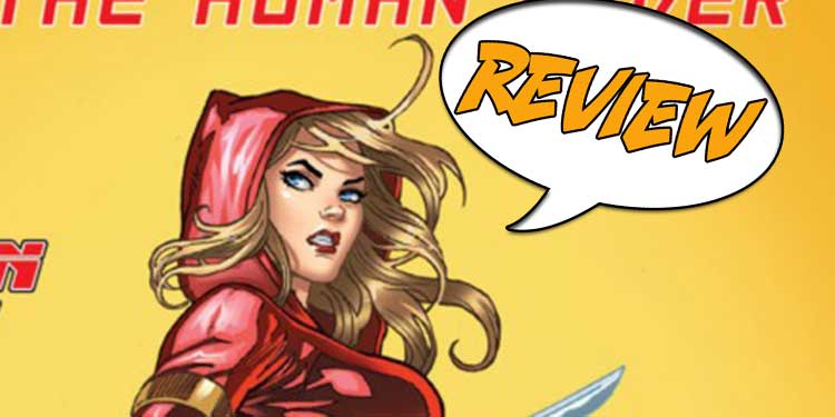
Red Agent starts with a bang, but can it keep that going throughout?

Writer: Joe Brusha and Lou Iovino
Artist: Wilton Santos and Marc Rosete
Colours: Hedwin Zaldivar
Published by: Zenescope Entertainment
Cover price: $3.99 USD
Previously In Red Agent: After the Apocalypse the Highborns hide in plain sight and the leaders of the world use them for their own gain. Britney Walters, AKA the Red Agent, is part of the Highborn Initiative, an organization intent on redressing the balance, battling the forces of evil that lurk in this shadowy world.
Desperately wanting something to be good makes it worse…
I haven’t had time to keep up with my second favourite ongoing universe recently. Outside of the cheesecake covers and vaguely dubious interiors, I have always appreciated Zenescope’s twisted universe. It grew out of modern re-tellings of the Grim Fairy Tales with the world of Alice thrown in for its insanity and it has developed into its own complex mythos. But for me it has always pulled in two directions, sometimes managing it perfectly and other times failing to walk that line.
The universe sold well on the back of sexy covers and plunging cleavage and throughout its 10 years it has lurched from restrained to overt, still publishing is yearly swimsuit edition, but spinning it as a comic by including a 5 page back up story. This issue is no different and I take away two main concepts from this comic. Firstly, it has a really good set up for an ongoing 12 issue series, even if it is a bit formulaic, but secondly, this comic was all about putting Britney’s “assets” in as many panels as possible.
I will be honest, it really must have taken a lot of thought to work out how to cram her chest into the corners of panels, it sometimes feels like that was the first thing they drew and then put the rest of the action around it.
You might think I am over-doing this point, but it actually affects the book quite badly in the action sequences. Some of the best artists manage to make still panels feel like movement by how the next image relates to the previous one, but this feels more like jerky stop motion than smooth CGI.
Two brilliant artists don’t always work
Being fair to the comic and not over analyzing it too much, the art is pretty special in places, but it falls foul of one of my pet hates – two artists on the same book. Don’t get me wrong, this can work, especially if one artist is doing the main story and the other a flash back sequence. They do similar tricks in films and TV by putting the ‘other’ storyline in sepia or muted colours so you can always tell what part of the story you are in. However for me randomly changing the artist in the middle of the story ruins the immersion.
It is even worse if you decide to change the colour palette at the same time. You can manage to bring together different artists work if you keep the colourist the same throughout, or even the inker, but when the lead character goes from a matt red suit into what looks like an identical gloss leathers suit, it really yanks you out of what you were reading.
Both of the artists do a really good job, especially when you consider they were clearly required to accentuate one specific attribute in each panel, but together they just don’t seem to work well enough. Again this can be worked through if the story is strong enough, but with Zenescope’s focus on the art, this can leave the book a little lacking at times.
High expectations almost always lead to failure
Much like the biggest blockbuster films almost always leave you disappointed, whenever you have really high hopes for something, inevitably it doesn’t live up to those expectations.
This is not a bad book, it’s a perfectly acceptable introduction to this new series, although for a first issue I might have appreciated a bit more exposition than we got. While I am very familiar with this world, even I was drawing a few blanks throughout, but perhaps that is the point of the series, it’s hard to tell. The end leaves us with cloaked figures with no clue of who is underneath and the introduction to the series makes a lot of the fact that this is supposed to be a “spy” book, so mystery is clearly part of the attraction.
It really doesn’t feel like a spy story, neon glow red leather cat suits have never been the best camouflage unless you are trying to infiltrate comicon and for that matter neither is a blue skinned Bane impersonator or a robot the best companions.
However the art is really good (so long as you don’t mind the change) and the story interesting enough. If you buy these comics for the “view” you won’t be disappointed, but I think I expect a bit more these days.
[taq_review]Dear Spoilerite,
At Major Spoilers, we strive to create original content that you find interesting and entertaining. Producing, writing, recording, editing, and researching requires significant resources. We pay writers, podcast hosts, and other staff members who work tirelessly to provide you with insights into the comic book, gaming, and pop culture industries. Help us keep MajorSpoilers.com strong. Become a Patron (and our superhero) today.


