Or – “An Inauspicious Beginning…”
These days, Image Comics is well-regarded as a clearinghouse for independent creators who want to do something that might not fly in the corporate shared-universes, but there was a time when fans like me thought of Image, rightfully or not, as the place to go for cutting edge X-Men and Teen Titans rip-offs with mediocre art and nothing much to say. Still, every stupid prejudice has to come from SOMEWHERE, and I am lucky in that I can easily trace the source of my youthful anti Image bias to a single comic by a single creator from my twenty-second year on the planet. I would say this is that story, but “story” isn’t exactly the precise term for what we’re about to witness…
 YOUNGBLOOD #1
Plotter: Rob Liefeld
Scripter: Hank Kanalz
Penciler: Rob Liefeld
Inker: Rob Liefeld
Letterer: Rob Liefeld (?)
Color Designer: Brian Murray
Color Separations: Digital Chameleon
Publisher: Image Comics
Cover Price: $2.40 (Current Near-Mint Price: $1.50)
Previously, on Youngblood: The New Mutants, with respect to their fans, were pretty much utterly in the gutter by 1990 or so. The pre-teen X-Men wannabees had been almost graduated half a dozen times when the man called Cable arrived from the far-flung future. His presence reinvigorated the team, mostly due to art by the early-90’s newest new hotness, Rob Liefeld. From his first professional work on Hawk & Dove, Liefeld had catalyzed fans and pros alike with his unique stylings, and was an early advocate of the “artist as rock star” paradigm so often seen among comic creators today. When Marvel’s fields proved too limited for his taste, Rob got together with Malibu Comics to launch his own creator-owned enterprise, bringing some of the characters that inhabited his head to the world and igniting a firestorm of sales, criticism and toothy grimaces. The story of Youngblood (or one of them, anyway, as this issue is a flip-book with not one, but TWO Youngblood teams in it) starts with a thinly-veiled middle-eastern dictator named Hassan Kussein being targeted by a federal special missions force code-named G.I. Joe Youngblood! Leaping from helicopters that look just like their guns, the team looks snappy as hell as they invade a sovereign nation and spark an international incident. Also, take note of their awesome dialogue…
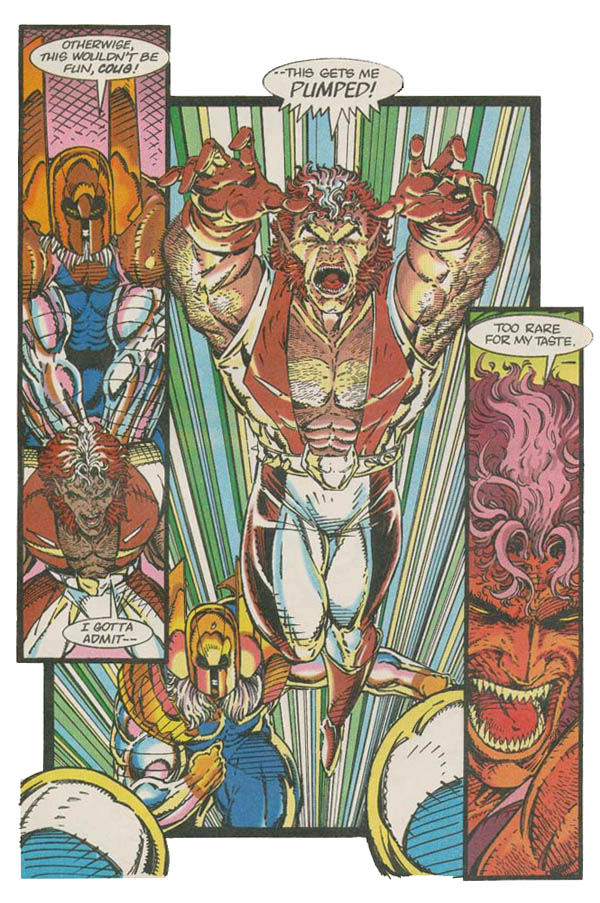 Combat and Cougar are apparently the workhorses of Youngblood’s “Away Team,” as an inordinate portion of this issue is devoted to their buddy-cop chemistry and sideburns. Much has been made of the fact that the central figure above seems to have been traced from a Kevin Maguire Guy Gardner figure from an early issue of Justice League volume II, but I have to say that it’s probably one of the better constructed figures in terms of perspective. The Away Team is also home to Psi-Fire, an insanely powerful telekinetic wearing a palette swapped Changeling costume, who is also the only team member with real character in his dialogue…
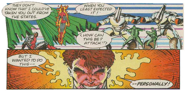 He also may or may not have eyes. No one is sure. The team’s leader, Sentinel, is sort of like Iron Man, save that he doesn’t armor his head, and there’s a big strong bohunky guy named Brahma and a half-naked girl named Riptide as well, but they’re mostly invisible in this issue. Combat (who is shown to be an alien in one of the sourcebooks, but seldom treated as such) gets his helmet knocked off in battle, causing him to launch into a berzerker rage which also makes his shoulder pads appear and disappear at will…
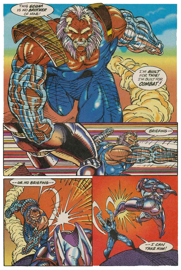 Combat is like the Chuck Norris of Youngblood, and with Rob drawing, there may actually BE another fist under his beard. He also varies wildly in size, though I’m not sure if he has growing powers or not. Psi-Fire punches through the enemies defensive line, even with their futuristic armor, and proceeds to MURDER A FOREIGN POTENTATE ON HIS OWN SOIL.
 This moment is completely played for laughs, something that I suppose would have been kinda sorta understandable in that “Operation: Desert Storm” timeframe, albeit in a very juvenile and callous fashion…
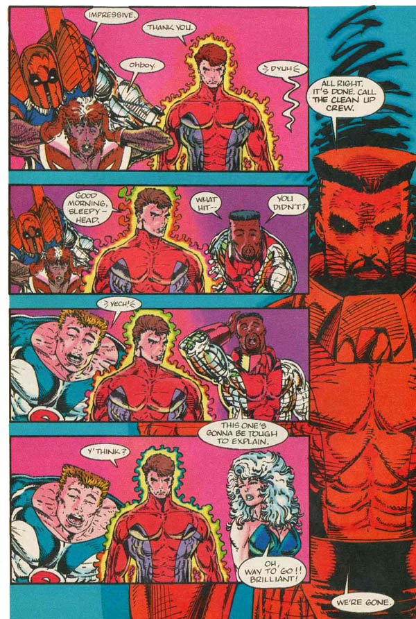 The Away Team’s actions are explained away with a headline indicating that Kussein took his own life, but you have to wonder how much political clout it took to pull something like that off. The other side of the flip-book is the Youngblood “Home Team” story, which admittedly has a bit more character building in it, starting with team leader Shaft. While shopping with his girlfriend Shelly, he witnesses a purse snatching… or a shoplifter… or something. The art isn’t clear, save for the fact that a young African-American man is fleeing the scene. Who’s the man with a tiny head and thighs so thick from eatin’ bread? SHAFT! Can you dig it?
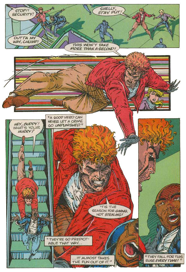 Who is the man, who will snap your spine, in his bare hands? SHAFT! I can’t heeeear yoooou! But the purse-snatcher is a ruse to get America’s top super-cop out in the open, and girlfriend Shelly screams about a sniper in the upper levels! Whose the cat who won’t cop out, even if a Bic retractable is all he’s got? (That one didn’t really work, did it?) SHAFT! (Thank you, ladies…)
 I don’t know if you noticed, but “no arrows!” Shaft’s emergency beeper goes off, probably due to the fact that one of his partners murdered a foreign dignitary, and he rushes away, arms akimbo, while his teammates also leap into action!
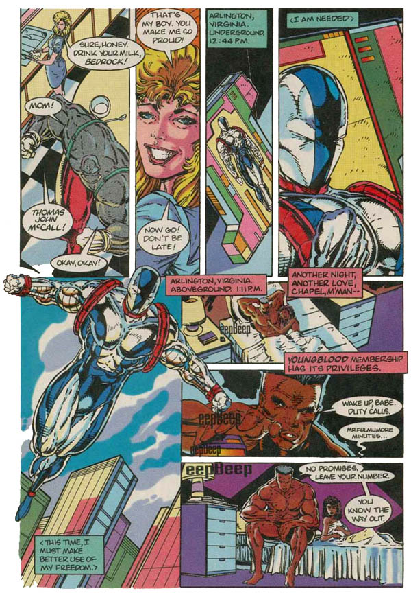 Bedrock! Die-Hard! Chapel! Vogue! Photon! I remember one evening in Otter Disaster’s basement apartment in Hays, as we spent some time working our way through a list of good Youngblood member names, all of which were about as good as those. PAYCHECK! BASEMENT! HUBCAP! SQUIRREL! I also enjoy that fact that Chapel’s “membership priveleges” apparently include groupies, which seems a bit odd for a secret government operative guy who kills people for a living. Turns out that the emergency is a breakout at a prison facility where villains are allowed to keep their full weapons and armor…
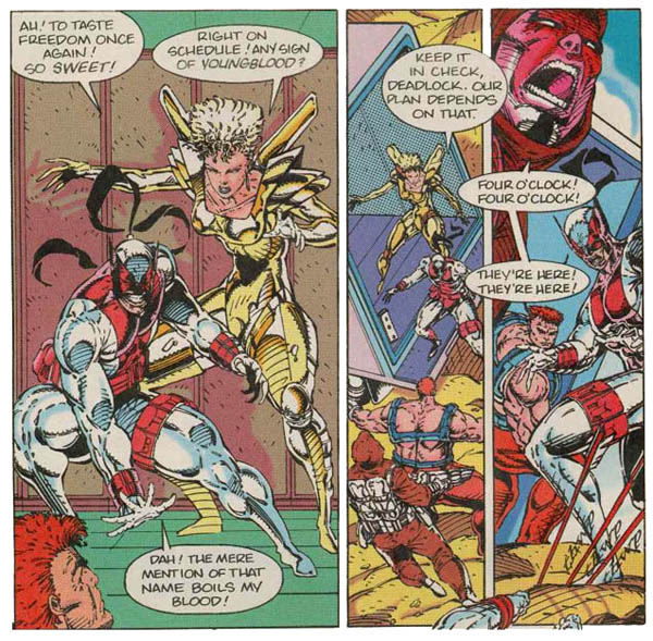 By contractual obligation, every Rob Liefeld comic MUST contain a character with a pointed cowl and a big gork wearing a harness (although having more than two arms is optional in the big gork.) Youngblood arrives in heroic splash panel and…
…
…the book just sort of ends. There’s no “Continued,” no nothing, and the issue just sort of ends there. It makes me wonder if some of the space allowed for Combat and Cougar ripping out throats might not have been better served giving the Home Team’s story some sort of climactic moment. At this point in Rob’s career, he could have probably worked with many talented writers (I believe this was right after his 501 commercial started airing, and he was probably the most recognizable fresh name in comics circa ’92) but chose to work with his old friend Hank Kanalz, an untested name whose dialogue left much to be desired in developing character or strengthening anything but the sheer “AWESOME!” factor. In later years, Rob would become famous for his aborted launches of things (Agent America/Fighting American, his Bionic Woman/Six Million Dollar Man comics, a T.H.U.N.D.E.R. Agents revamp and much MUCH more) and with each failed relaunch, it became clear to me that once the characters are unveiled, he has no idea what to do next. This issue doesn’t really even bother to introduce many of the characters, and as the series continued, the roster became a mercurial thing as new notions launched themselves into his skull.
This week has been a strong one for comics, and since I ended up giving TWO of the hard-to get 5 star ratings, I wanted to look at the other end of the spectrum to make sure that my reviewing instruments were still properly calibrated. To be honest, this book IS an important moment in comics history, a clearly defined stepping stone away from corporate work-for-hire and into the era of the creator-owned title, but it just flat isn’t any good. For all the hype and hooplah (and in ’92, there was a TON of hype, due mostly to Wizard Magazine), this is essentially the prototype for the “ashcan” issue, identifying the characters and mise en scene, but doing little beyond that. I bought this issue off the stands at a time when the average book cost $1.00, but to paraphrase one of my favorite writers, they can KEEP the money, I just want my TIME back. Youngblood #1, as important as it is, as daring as the experiment eventually became, consists of warmed-over knockoff characters, stiffly drawn, barely dialogued, with no real story-telling skill involved, earning the absolute minimum possible score of 1/2 star out of 5 overall. People have sometimes joked that Major Spoilers exists to read comics so you don’t have to, but in this case I hope I managed to take one for the team and kept you away from snagging this out of the next Quarter Bin you encounter…
Faithful Spoilerite Question Of The Day: I expect I’ll hear from fans of Mr. Liefeld, and possibly of this book… What books do you love, regardless of how poor the critical reception is?



19 Comments
a very thorough and justified massacre of a truly terrible stain on the history of the industry. Linkara, another online reviewer, did a video review of this as well as issues 2 and 3, and quite frankly i’m surprised ANYONE, including Leifeld himself, could look at this terrible artwork, garish colors, and childish dialogue any of the issues and send them to the presses. i mean a two year could write this. how did this last? were there really people interested enough in this story (if it can be called such) to warrant more of these?
It’s as if the plot was written on the back of a business card, and half that card was torn up. I bought the first 10 issues, where they introduce a new character every issue it seems like, the reason I torture myself is to grind into the synapsis of my brain, that I can do better than this.
Your review is a justified one, and even handed. I would have done the title, Retro Review: Youngblood #1, and after the jump had a video of me placing it in a pan, and setting it on fire.
I got this when I was very young in a comic pack to read while flying overseas.
Even when my mind wasn’t fully developed I recognised this for what it was.
Your awesome for retro reviewing this!
What’s really amazing is how both the character designs, poses, and panels are almost carbon copies from his earlier New Mutants and X-Force work.
As an owner of this issue, and many other early image stuff I now wonder… How were we all so gullible in the 90’s.
I feel…dirty and ashamed for not only owning this but owning at least 3 copies!
@Rome: You and me both! I don’t think i care to list how many doubles and sometimes triples of books (sad I know) during the 90’s. How many were like me hunting down the Shadow Hawk and Wetworks #1’s? Valiant’s Unity and all it’s tie ins priced me out of that racket before I could even start. I’d like to think it was my young brain that didn’t understand how writing is the core and art a very close 2nd but that would be lying. I’d like to thank James Robinson (let’s ignore pretty much everything after Starman) and Mark Waid for making me realize that writing is important.
Wasn’t there some kind of re-written directors cut of this out there? Anyone actually buy it? Love to see a comparison next to this.
Yeah they released the first 6 issues in TPB/HC form with a rewritten story by I believe Joe Casey. I would also like to see what Matthew thinks of that compared to the original.
I’d be leery of my ability to give it an unbiased once-over, to be honest…
@ Scott C. The writing at Valiant is what kept me going through this time, and I remember it well, since I started collecting comics in the early 90’s. It was hard to not walk into a comic store, and not see Image plastered everywhere. And all of it was crap, but it was new, and 1st issues back then, people bought them just to have them. Image had a new title or miniseries starting almost monthly. And for the series that they did have ongoing, they were always shipped late. People were buying Image at that time, just speculating that they would go up in value, and they did for the brief time they were still fresh. The limited series for Youngblood, Wildcats, and Savage Dragon all were valued higher than cover price for many years. But I don’t remember anyone saying that the stories or writing was great. It was crap, embellished with embossed covers, and gimmicks. I was one of them, I bought them hoping they would value up, but I also bought the quality that came from Valiant, Vertigo, Dark Horse Legends, and Wildstorm at that time. Starman was a great comic, no argument there.
Liefelld in his *shudder* prime.
Don’t get me wrong, when he first came out, it was different from the usual artists of the day. Took a while to figure why it was so groundbreaking.
Rob spit in the eye of anatomy, backgrounds and drawing feet with a special kind of panache that no one younger than a pre-teen can hope to duplicate. Wish he could’ve brought out some better artistic talent from the manmy pouches he drew on his characters, but his ability to improve on his art style never came to life.
Still, I haven’t gotten rid of my New Mutants 85. First time I saw his work. Gotta remember the past to look toward the future, right?
Good review. Yeah, at the time, Liefield could have just spat into a tissue and people would have paid money for it. But I guess this was the beginning of the end. Just goes to show that having a history and a good writer and, most importantly of all, good editors to keep everything in check is part of why certain comics go from strength to strength.
This was one of the first American comics I bought when I first started collecting and I was blown away with the dynamic art, and spritely dialogue. I thought if all comics are this good then this is going to be a great hobby to get into, little did I know that comics come a great deal better than this one. But Youngblood and Rob Liefeld still have a very special place in my collection. I have all the Youngbloods and occasionally flick through them, and, yes, I still love ’em.
Hey Mr. Liefeld, fancy meeting you on this site. ;) Lol, I kid, I kid.
Linkara started his reviews with a text review of that issue!
Linkara started his reviews with a text review of that issue!
I don’t know who that is. :)
A comic book reviewer for the website ‘That Guy With The Glasses’. He specializes in reviewing particularly bad comics, Liefield being a specialty.
Oddly, even as a child of the 90s boom, this didn’t appeal to me. Liefeld’s stuff was just so painfully macho that it was instantly off-putting to me.
Matthew, you really need to watch some of Linkara’s reviews (although I kind of think his whole “storyline” thing is getting a little overdone at this point & wish he’d dial it back). They’re pretty good.
What books do you love, regardless of how poor the critical reception is?
Team Titans, first year, full stop. The Marv Wolfman that had done the good NTT run was back for a bit after having to play the editor’s “Let’s copy Marvel” game and turned in some good pieces about a group of people trying to adjust to a timeline where they wouldn’t exist & would be seen as hopelessly out of place. It showed he wasn’t totally burnt out, & I liked that he could even get some humanity & relatability from a failed Cable parody. But with the second year, it all sort of went off the rails after his departure thanks the overambitious nature of the new writers’ plans (they tried to cram a three-year arc into four issues – madness!). By the end, after having seen my favorite character go from being Miss Sunshine with wings to a giant bloodthirsty killer chicken, DC decided to sweep it under the rug & turn most of them into anonymous Zero Hour fight scene fodder. Considering some of the writers’ plans that they had, I’m actually kind of glad they had a less ignominious ending.
I could go on & on about the missed opportunities of the Teamers, but I’ll stop. Here’s hoping Mirage (the last one left) & her daughter are left off-screen indefinitely instead of dragging them out to be some more crossover fodder.
I’m willing to bet that Stephen would definitely say that the worst example of non-detailed backgrounds from Atomic Robo is a million times superior to the best example of background details in this book, which range from thatch work to diagonal swipe lines, with a little solid pink color from earth to sky for variety.
I don’t know why but the image above with Chapel in bed (aboveground in the dark apparently at 1:11 pm and just waking up), the blonde girl a panel up and to the left just really looks like it was yanked from either a Salem Slims cigarette add or some toothpaste add from a magazine. Not to mention all the footless/feetless people teetering around on their stubs or randomly standing behind all the sundry boulders that people keep leaving around. Maybe that’s one of Badrock’s powers, he can drop a giant boulder duece that people can protect their ankles behind. Hmm….
I also thought that Psi-Fire’s costume (especially from behind) looked a lot like Spider-man’s costume, using just that basic color/shaped design layout.
I was a child of the 90s boom and was really freaked by the Image stuff.
My interest in them came from the fact that:
1. The art (as Mathew has pointed out) was quite different. Honestly, with the exception of Rob Liefeld, the other Image guys weren’t really that bad.
2. I was a Marvel Zombie and in my quest for more Marvel stuff, i simply followed the Marvel guys to Image (bad,bad mistake).
3. I needed an alternative from the big two. For good or for bad, Image was an alternative.
I still have my Image stuff in my stack and still go through them from time to time. To me, the Liefeld stuff falls into the “it’s so bad it’s good category”
After I finished reading Youngblood #1 & the rest of the mini-series, I really exclaimed to myself that this is ewesomely rubbish series from end to end. I kept seeing rip-offs of Wolvie, Beast and The Thing from time to time. This is the era where everyone draws like Jim Lee. If given the opportunity, I would like to redraw & recolor this comic to keep up with the present.
Do you remember Stephen Platt? He’s a prodigy of Liefeld in anatomical misproportions but I really adored his smudged, dirty cross-hatched drawing effects during his Moon Knight & early Prophet days. Hope you will do a Moon Knight 55-60 review. Thanks.