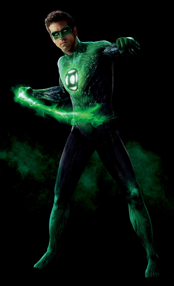
Here’s another look at the Green Lantern costume worn (virtually) by Ryan Reynolds in the upcoming Warner Bros. flick.

There’s been a lot of talk recently regarding the costume, and since it seems to be a sticking point for many of you, here it is again. Do the details of the costume matter? While some of us may be put off by the visible toes, and the general organic nature of the costume, the bottom line is the costume should let viewers know right away that this is Green Lantern. My nearly four-year-old son saw this picture on the RSS feed the other day, and proudly shouted, “Hey, look! It’s Green Lantern!”
Sounds like mission accomplished to me… but then again, my kid is four, what does he know…


16 Comments
Doesn’t matter to me hardly at all. It has the symbol on it. It’s green. Yay.
What I’m more curious about is how this will be made into a good story that’s accessible without completely abandoning the source material. Haven’t seen enough from the previews to say whether that’s the case or not.
I don’t really LIKE the costume, but I am sure I will still enjoy the movie, especially after the trailer footage from Wondercon. I really enjoyed what plot elements I saw in that, and am sure that as long as they have the iconic elements (the big thing on his chest…) it’ll be recognizable as Green Lantern, and that’s what matters.
At first, I really did not like it. Then, after awhile, it grew on me. There’s still a little bit for me to overcome, but, overall, it works.
Completely personal hang-up, but with the mask on for some reason I keep thinking he’s Ben Stiller.
other than that and the toes, it’s good enough for me.
Looks pretty neat, I hope it does well.
Wow. Had not noticed the toes. What. The. FrenchToast. Horrible.
Feet aside, I understand why Hollywood needs to one-up the standard design. Would have preferred CGI spent on various designs of a green glow rather than green Tron lines. Opportunity missed.
I have no problem with this costume.
I understand why they kept the toes showing, but aesthetically it just looks a little off. I love the look of the costume with that one exception though. Presuming they are using the ring as the source of his costume, the look they have given it is very logical and works well.
As awful as the previews for this have looked, I think the costume is the least of their worries.
As much flak as the new Wonder Woman was giving. Not much is being made
of his bootless feet.
Not a fan of the feet, but oh well. It’s just the 21st century version of Bat-nipples. My ‘issue’ (not even that big a deal, really) is that this seems more a Kyle Rayner costume than a Hal Jordan costume. Nitpicking? I honestly don’t know.
Where are the white sleeves and gloves? No one has commented about the white missing from the costume. Major aspect of the costume and the story line. White part is there in everything. It is just off balance and distracting.
when they brought Kyle onto STAS, he only had white in the sigil. They kept this design for John on JLU, which then crossed over to the comics, seeing as how it was similar to the design he was already wearing. After that, it entered into the Corps as canon, and Hal and Guy became two of the VERY few who have white gloves, now. Even Kyle’s current costume has adopted the white glove look, but not very many others have it.
also, the GL: First Flight Hal has the green armbands and black gloves from the STAS costume, as well.
It may be nitpicking, but to comic fans who are major parts of all these movies and major word spreaders of a movie being good or not the white gloves matter. If something is disturbing then there is a problem.
The reason for the toes is logical ,white gloves is neither here nor there.