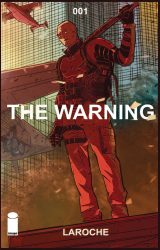
The Earth is being invaded, but we don’t know by whom. We do know they are coming from space and are already setting up a base. We have our best people on it, our best people, and they have activated Gladiator Two-Six, an international military response group. See how it all starts in The Warning #1 from Image Comics, on your local comic store shelves now.
 THE WARNING #1
Writer: Edward Laroche
Artist: Edward Laroche
Colors: Brad Simpson
Letters: Jaymes Reed
Cover: Edward Laroche
Publisher: Image Comics
Release Date: November 28, 2018
Cover Price: $3.99
Previously in THE WARNING: Edward Laroche is the creator of The Warning and has been working as a storyboard artist for nearly twenty years in the field of animation and advertising. His credits in the field include such series as The Avengers: Earth’s Mightiest Heroes, Megas XLR, and Extreme Ghostbusters. Additionally, he has self-published two graphic novels, Almighty and Waveform.
A CALL TO ARMS GOES OUT
A soldier stands in a field and reflects on the nature of life and reincarnation. A scientist, her most recent project shut down by the government, is told her team is being reactivated, off book. The staff of a forward operations base reveals an anomaly they have been monitoring is growing, the originating point a rogue planet moving toward Earth.
This is the world of The Warning.
The soldier is a member of a military force with the designation Gladiator Two-Six and he has been called up to respond to the anomaly which was detected in an unnamed West Coast City. Several months ago a group of military related scientist detected the appearance of a small quantum field. While they originally thought it was natural, they soon discovered it was not. An energy signal has been detected, an energy signal from outer space. They now believe it is the first stage of an invasion. A scientist with Radient (sp) Genomics has had her team reactivated and assigned to assist on the preparation of a response to the event. Her cancelled project, Quiet Knife, is now a go.
A CINEMATIC OPENING WHICH HINTS AT THE UPCOMING CONFLICT
Edward Laroche (Black Dynamite, All Crime Comics) is the creator and artist of The Warning. He is also an accomplished storyboard artist who has worked on multiple cartoon series you probably have heard of and has self-published two previous graphic novels. The Warning looks to be an ambitious opening to what could be a great series, but it also looks as if it will take more than just the first issue to gain steam.
Laroche’s writing for this issue possesses a fluid like quality and even has a poetic quality. At times he strings together words in a way that makes you heard them almost lyrically. That said, there is also a lot of technobabble present. Several sequences are filled with the dialogue to make you realize there are some shady procedures being used on the soldiers, and it often went to an extreme. There is also some very convincing dialogue used with military lingo that sounds as if it would be very correct and appropriate if you had just stumbled into the room where it was being spoken. In that way, The Warning has a good, solid level of realism which sets the stage for the seriousness of what is occurring.
Larcoche also provides the artwork for the series and draws heavily on his experience as a storyboard artist. There are multiple set-up panels, each one feeding into the next, and building up a sort of pacing that takes you by the hand and leads you through the sequence. To add to that cinematic feel, all of the panels are designed horizontally, giving you varying degrees of a widescreen experience. Multiple panels per page are devoted to leading you to the focus of the sequence, changing widths and angles until you finally arrive at the payoff. His actual line work has a nice, consistent sketch feel to it. There is a solid continuity which, in my opinion, is owed to his years of animation experience.
The colors for this issue are provided by Brad Simpson (Sex, Catalyst Comix). His use of a real-world palette gives a solidity to the artwork and fully fleshes out Laroche’s vision. There is a wonderful use of shades and tones to give well thought out lighting and shadows, with exceptional success in a sequence of panels which are lit by a red light and later the computer monitors at the forward operations base. They seem to actually glow with their own power.
BOTTOM LINE: A SOLID, IF SOMEWHAT SLOWLY PACED, OPENING
This first issue of The Warning does a wonderful job of setting the stage for the upcoming conflict. However, at times this set-up is very slow and there may be a danger of losing some readers. There is not any real action in this installment as all of our time is spent establishing the characters and the conflict. While that is not an entirely a bad thing, it feels as if we are seeing the title sequence of a high concept action movie. That concept has a good feel to it, and I would be interested in seeing how this one plays out over the next few issues.
THE WARNING #1 shows great potential, with a high concept focus and an interesting cast of characters. I feel, however, it just may take more than just this first issue to grab you enough to keep it in your pull box.
The Warning #1
THE WARNING #1 shows great potential, with a high concept focus and an interesting cast of characters. I feel, however, it just may take more than just this first issue to grab you enough to keep it in your pull box.
-
Writing5
-
Art6
-
Coloring8


