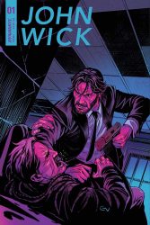
Who’s the cat that won’t cop out when there’s danger all about? That would be Shaft. The one you really need to watch out for is John Wick. He’s coming for you, in this review of John Wick #1 from Dynamite Entertainment.
 JOHN WICK #1
Writer: Greg Pak
Artist: Giovanni Vallentta
Colorist: David Curiel and Inlight Studios
Letterer: Tom Napolitano
Editor:Anthony Marques
Publisher: Dynamite Entertainment
Cover Price: $3.99
Previously in John Wick: You should never have killed John Wick’s dog…
A bit disjointed
… or interrupt John Wick’s love for pie. Though Wick doesn’t throw down in the middle of a restaurant, he does follow those that annoyed him to a hotel where an assassination attempt on Charon, a past associate of Wick’s, is about to go down. Via a flashback, readers learn the one of the assailants once tried to kill Wick when he was a young boy in Baja California. That means it is time for a big action sequence with a lot of gunfire, because… Revenge. Yes, capital letter Revenge as Wick doesn’t let anything go. And doesn’t let anyone survive his counter attack.
There are a few moments in this issue where the story telling feels really disjointed. One sequence has Wick busting into a run down hotel(?) feeding a cat, and then leaving to go to a weekly rate hotel. Why is that sequence there? It could easily have been excised. There are also similar moments in the story where the point of view is skewed making the story more confusing than it needs to be. This isn’t a bad story, there are just moments that seem missing, or perhaps greater explanation. Of course this is comic books, and with a loner character, and there is no way to know what he is thinking…
Maybe it is the art?
While the character work is solid in this first issue, I think some of the confusing elements in the narrative come down to shot selection. Just before John Wick jumps from one building to another, Vallentta uses a close up of Charon. Granted, this shot is a subtle one to indicate Charon could use some help, but John only acts when he recognizes Pecos in the room. Since Pecos is the one who tried to kill him as a child, that is the close up that should have been used instead.
Even the moment when John and Charon recognized one another from across the alley seemed out of place, and required rereading the sequence a few times to figure out the timing of the events that followed.
While I like the character work, some of the action sequences aren’t a fluid as they could have been. In one shot Pecos has a gun in his hand, the next panel, John has it in his and is killing his foe. Yes, Wick is that fast (especially with all the action lines in the background), but something is needed in between those two panels to smooth the transition.
I do like the screentone dots that are used in the issue, and the coloring is good, even when you have to figure out whether John is wearing blue pants or black.
BOTTOM LINE: From Film Franchise to Comic Books
I know the studios want a third John Wick film to hit theaters soon, and I can understand why – 90 minutes of pure adrenaline with guns, killing, and a man going after those who killed his dog. Sometimes that works, and sometimes it doesn’t. While there is action in this book, and Greg Pak does a god job at setting up the revenge story, I think this issue ultimate stumbles in the execution of the execution scenes. If you love John Wick, then you’ll want to find out more about who this character is, and why everyone is out to kill him. Though John Wick #1 has some problems in the visual narrative, it is still solid, earning a Good Buy Recommendation.
[taq_review]
Dear Spoilerite,
At Major Spoilers, we strive to create original content that you find interesting and entertaining. Producing, writing, recording, editing, and researching requires significant resources. We pay writers, podcast hosts, and other staff members who work tirelessly to provide you with insights into the comic book, gaming, and pop culture industries. Help us keep MajorSpoilers.com strong. Become a Patron (and our superhero) today.


