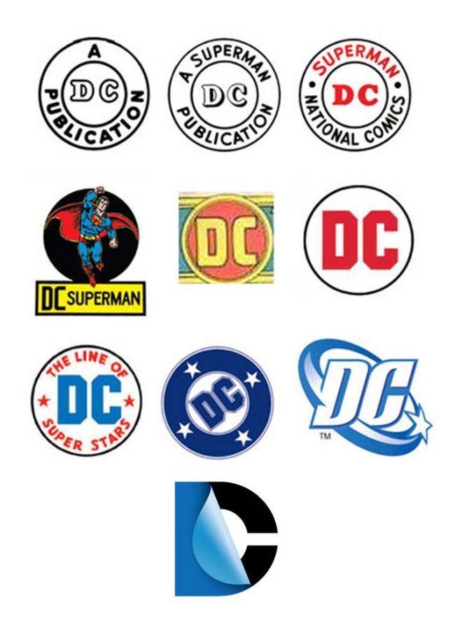
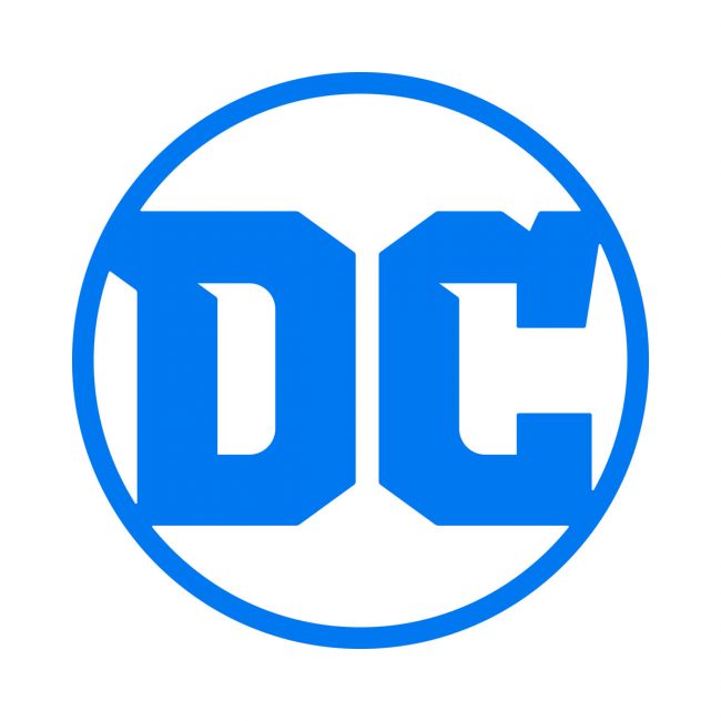
It was only a few years ago that DC Entertainment changed up its logo to the pealing D. A lot of people complained about it then, but seeing how the company has used the logo, I’ve grown used to it. I wonder what the Internet will think now that the logo has changed again?
“While comics continue to be the heart and soul of DC, the brand has evolved to now stand for powerful storytelling across so many different forms of media. DC is home to the greatest Super Heroes and Super-Villains, and the new logo has the character and strength to stand proudly alongside DC’s iconic symbols,” stated Amit Desai, DC Entertainment Senior Vice President of Marketing and Global Franchise Management.
It does have an old school look to it, and with Rebirth kicking off on May 25th, it seems like a great time to try and remind everyone of the company’s past on the cover of DC Universe: Rebirth Special #1.
“I’m very proud that REBIRTH will be the first comic book published with the new DC logo.” stated Geoff Johns, DC Entertainment’s Chief Creative Officer. “To me, REBIRTH and the new DC logo are built on what’s come before while looking to what will come tomorrow. I can’t wait for people to see it on the cover.”
The new logo will find its way across all of the company’s assets including the website, social media channels, DC All Access, apps, and other projects that rollout over the next couple of months.
So, what do you think?


![[Business] DC Entertainment rebrands DC logo (again)](https://majorspoilers.com/wp-content/uploads/2016/05/DC_Logo_Blue_Final_573b356bd056a9.41641801.jpg)


6 Comments
DC do seem to have something of an identity crisis when it comes to their repeated re-branding! I don’t recall Marvel ever changing their logo but I’m happy to stand corrected…
The re-brand is probably an effort to try and make them look fresh and relevant when for me, it just comes across as “look at me! look at me! please look at me!”
They should stop looking at their corporate branding and worry about their content quality- for a long time, I’ve inferred that DC actually stands for Disappointing Comics. There’s just so little they do that I actually want to read or watch anymore.
Looks really old-school. I like it.
Really hate it. It looks like a font on dollar store toothpaste.
… so that’s why I thought it reminded me of something!
Not a fan. I thought the previous logo had great cross-media appeal. This one seems like a poor step back.
I was never a fan of the “pudding cup” logo. It always just felt very bland, and focus grouped to me. I like this, a bit retro, and while not my favorite of the DC logos still good. The pudding cup always felt to me like it was ashamed to be a comic book company logo. This not as much, but YMMV.