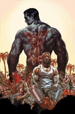
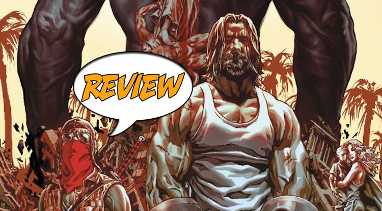
What do you get when you take a new, futuristic Los Angeles, mix it with Mad Max style gladiatorial combat and sprinkle social commentary? The answer: Suiciders #1 by Lee Bermejo. Major Spoilers takes a look at the new Vertigo series and has a review for you after the jump!
 SUICIDERS #1
Writer: Lee Bermejo
Artist: Lee Bermejo
Letterer: Jared K. Fletcher
Colorist: Matt Hollingsworth
Publisher: Vertigo
Cover Price: $3.99
A CALIFORNIA DIVIDED AGAINST ITSELF
I wasn’t sure what to expect from Suiciders #1. I knew there would be some cool art and crazy violent action but I didn’t think subtle societal commentary would be included. Lee Bermejo sets his story in a futuristic Los Angeles, now New Angeles, where a wall has been erected after a devastating earthquake years before. The wall divides the classes of the city between the well off and the poor, and racial discrimination is implied as well. On the anniversary of the quake there is a sports event. Enter the Suiciders: combatants with surgical enhancements who fight to the death in an arena full of traps and weapons. While I enjoyed the fight scene I was more intrigued by the setting and wanted to see more of the class division. Information is given mainly through dialogue and we barely get to see the other side of the wall. It’s said that the rich all have enhancements and surgery but other than the gladiator Saint, none of that is prevalent. Another problem is the protagonist isn’t introduced. There is no one the reader should be following through the story yet and it is abundantly clear this is a setup issue.
Though it sounds like I didn’t like the issue I did enjoy it quite a bit. The Suicider match is amazing and Bermejo writes the sports commentator’s dialogue spot on. He writes all his characters well and even though he tells more than he shows, it’s subtle and less blatant than it could be. All the ideas are enough to hook a reader and I’m eager to see them expanded on. The scene where a family attempts to cross the wall is tension filled and draws some nice modern day parallels. There are some great ideas here and I hope Bermejo can show us a lot more in further issues rather than relying on dialogue.
IT’S NOT A COMIC, IT’S ART
When one of the commentators says that the Suicide match isn’t just a sport, it’s art, Bermejo gives us a glorious splash page of the combatants jumping towards each other in front of an industrial death machine with “KILL” in neon lights on it. It’s an in your face moment but it works and certainly proves Bermejo’s work is art. Extremely detailed and realistic looking I’m constantly amazed at what the man can do in a comic. Though it resembles the technique, if he uses photo reference I can’t tell and never get that “Hey I know that guy” feeling. Lack of movement is usually a downfall of this style but Bermejo’s is fluid and the Suicide match flows and is laid out wonderfully. The only issue I have, and it’s a constant with Bermejo, is the coloring is extremely muted. Browns, blacks and grays are the main part of the color palette and I would like to see more brightness. The lights during the match are a perfect example of how his work can pop with the addition of more color. Maybe this series will be the one to break Bermejo out of that mold?
THE BOTTOM LINE: GOOD INTRO WITH A LOT OF PROMISE
Lee Bermejo’s Suiciders is a book full of great ideas and takes place in an engaging futuristic setting. While the dialogue is well written and does a great job of setting things up, it would have been nice to be shown more. The lack of a protagonist to follow through the story is questionable for an opening issue. You can’t get much better artwork than this book and Bermejo will hopefully spread his wings in future issues and give us a better look at his world. I can’t wait for issue two and would take a Suicider’s punch if it meant I could get it now, assuming I would live.


