In the continuing rollout of the All-New Marvel New Nowness She-Hulk has once again received her own ongoing. This isn’t the first go ‘round for the lovely green lady (I believe this is her fifth) and it’s time for her to step out from the pages of FF and into the spotlight. Is this title good enough to fend off cancellation? Read on for the review!
 SHE-HULK #1
Writer: Charles Soule
Artist: Javier Pulido
Letterer: VC’s Clayton Cowles
Colorist: Muntsa Vicente
Editor: Jeanine Schaefer, Tom Brennan
Publisher: Marvel Comics
Cover Price: $2.99
Previously in She-Hulk: She’s been tearing it up in FF, going on some wacky adventures. She’s also been tearing it up at Paine & Luckberg, LLP as an attorney.
SO FUN AND UNIQUE MARVEL WILL PROBABLY CANCEL IT
My relationship with She-Hulk is not a close one. We’ve only briefly met in five issues Dan Slott’s run, the current run of FF and had a bad experience together in the pages of The She-Hulk Diaries. But something about her grabbed me and I’ve found myself somehow loving her. I don’t like Hulk characters much but her stories as an attorney have been immensely entertaining. I’m happy to say that this issue continues to separate her from most of the other Marvel characters. Charles Soule writes a fun, interesting story focusing on Jennifer Walter’s job as a lawyer. After quitting her job, Jen takes on Tony Stark of all people, representing Dr. Jonas Harrow’s widow in a case involving the patent of a piece of repulser tech. It’s got the humor that I’ve read in other She-Hulk comics and I felt right at home. Tony’s endless hallway on legal’s eighteenth floor was hysterical. I love that Soule writes her as a confident, strong woman. This is best shown in the opening as Jen quits her job after not receiving a much deserved bonus. She stands up for herself, firmly stating she deserves better. Like Fearless Defenders, this has a strong female lead who is written well, something much needed in mainstream comics. It was also nice to see a story told in one issue, providing a satisfying conclusion while also leaving incentive to continue reading.
My main concern is that this will not appeal to many, especially those looking for your standard superhero affair. If you’re hoping to see She-Hulk in costume punching people in the face, this is not the book for you (at least so far). The other problem is the story doesn’t necessarily need She-Hulk to be told. Apart from involving superheroes it’s a typical procedural type story and inserting any female lead would get the same results. I still loved it but fear it’s a title so good and unique that Marvel will inevitably cancel it after fifteen issues, much like Fearless Defenders. I hate to be the negative ninny so please Marvel, prove me wrong.
CRACKING TABLES WITH A FINGER
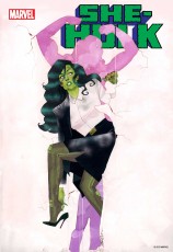
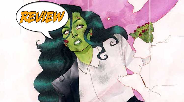
Javier Pulido has a wonderful art style that stands apart from others. I appreciate those artists and they’re typically the kind I enjoy most. Pulido’s work has a Mike Allred tone, fun and quirky. While it’s definitely quality art, it doesn’t completely work for me. Certain facial features were bothersome and I’m not convinced it’s the appropriate style for the title. There are some great panel layouts, particularly the scene on the eighteenth floor and Jen breaking a table in half with her finger looked like something out of an anime all the cool kids like. It’s strange because while good, it’s just not my cup of tea as they say. Kevin Wada’s covers are amazing too and I would love to see a book drawn by him.
BOTTOM LINE: A FUN STANDOUT MANY MIGHT NOT LIKE
She-Hulk #1 does a great job setting itself apart from other Marvel titles but it’s uniqueness may be its downfall. As with anything, some will enjoy it, others won’t. Rating it is actually hard as I loved the issue but can clearly see how others wouldn’t. Charles Soule and Javier Pulido tell a great story, albeit one that could be without She-Hulk. It deserves to be read but I believe the majority of superhero readers will avoid this one. I have to go with my gut on this one and recommend that you buy it. At least you may be encouraging Marvel to try new things. They are All-New Now! after all.


3 Comments
“Javier Pulido has a wonderful art style that stands apart from others. I appreciate those artists and they’re typically the kind I enjoy most. Pulido’s work has a Mike Allred tone, fun and quirky.”
I love Shulkie, but this #(@#% scribblenaut-art-movement-style crap is killing comic books for me. I like pretty pictures, not half-hearted watercolors.
Again, I didn’t care for it much either but I wouldn’t go so far as to call it half-hearted. I can recognize the good qualities of it but it didn’t work for me. But, I do normally like artists whose style is distinctive and stands out. Artists like Humberto Ramos, Skottie Young, Greg Capullo, Mike Allred, Chip Zardsky etc. People where when you see their art you immediately know who drew it.
I =despise= the art of Allred. I don’t think I like Humberto Ramos either, but I can’t think of any specific images. (I just googled for some of his images, and yup. Don’t like ’em.) I don’t know any of the other names you mentioned, but if they draw like this… I don’t like them either. I don’t dig “watercolors”. It looks like somebody started art school, and then dropped out before finishing all the painting classes. I’ve seen watercolor-art used appropriately, but still don’t “like” it. It will always be “kid-like” and “half-hearted” to me. Sure, they may be putting their whole heart into the watercolors, but it still leaves me wanting better art. “A” for effort, “D” for effect.
I like comic books that look like “comics”. Not “art class assignments”. That’s just my foible, I guess. Sadly, in this case it will prevent me from reading a character I’ve enjoyed in her previous solo series.