


DC continues to make the New 52, well, new with constant new waves of book. One of the titles to ride in on the most recent “wave” is Katana. The title character is also to be featured in Justice League of America and in the upcoming television show Beware The Batman. The real question is weather or not the character carry her own title. Well find out with this Major Spoilers review!
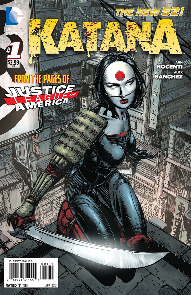 Katana #1
Writer: Ann Nocenti
Art: Alex Sanchez
Colors: Matt Yackey
Letters: Taylor Esposito
Cover: David Finch
Publisher: DC Comics
Cover Price: $2.99
A CUT BELOW THE REST
Katana #1 seems to be written like a really bad kung-fu movie from the seventies. The dialogue is straight up cringe inducing at times, and the plot is vague, giving me no reason to care about anything that happens, and just feels kind of ridiculous. There is very little characterization that happens, and the little that does happen just furthers to alienate me from the main character. I feel like I was just kind of thrown into the plot, with very little backstory to why anything is happening or why any of it matters in the end. There are some weird use of modern terms that just feel out of place, such as “Kawaii Park” and “epic fail,” they just do not jive with the more serious tone of the rest of the book. There is a lot of internal monologuing with Katana herself, and it feels overly explained. There would be no reason for her to explain so much of herself and her weapons to herself, in her own internal thought process. I know this kind of thing was common place in older comics, but in the twenty first century it just reads as very awkward.
STILL NEEDS PRACTICE
The art, overall, is pretty good. The coloring is especially great, inspiring a very japanese folk tale vibe. There are some points in the issue where the quality of the art drops significantly. It just becomes unbearably awful, especially in the very last panel of the book in which the antagonist’s face looks completely ridiculous. In fact, the artist seems to have a lot of problems with faces throughout the book, and does their best to avoid including them in a panel. Even the lettering in the book just seems very amateurish, and really could have taken more liberties in this kind of book, one that lends itself better to more exotic types of lettering.
BOTTOM LINE: CUT IT OFF YOUR PULL LIST
This is just not a very good book, and I cannot suggest it. It simply drops the ball on every front and does not have any kind of redeeming factor to it that would make me overlook these flaws. Skip it.
DID YOU READ THIS ISSUE? RATE IT!
Reader Rating
[ratings]
2 Comments
I’ve been following Birds of Prey, so I had a little context that helped. That shouldn’t have been necessary for a #1. The whole thing was shockingly uninteresting.
As an “old man” in comic book world, I feel there’s nothing shocking about it being uninteresting, and I didn’t even buy the book.
Honestly: Ann Nocenti’s work was crap boring when I was kid in the 1980’s. I can’t imagine it getting any better with age. The shock came for me when I saw DC was soliciting a book with her name on it in 2013. Really, what the hell?
I’m only buying two comic books these days.Two. If there is any perk to the New 52, it’s what I used to spend on books now goes into supplies to maintain the massive inventory I already have.
This New 52 stuff is a furry turd.