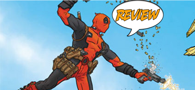
Deadpool is back, with an all new, all different creative team as part of the Marvel NOW! launch. The Merc With A Mouth is up against all the dead US Presidents, and only this Major Spoilers review can tell you how he fares in Deadpool #1!
 DEADPOOL #1
Written by Gerry Duggan & Brian Posehn
Art by Tony Moore
Colors by Val Staple
Cover by Geof Darrow & Peter Doherty
Letters by VC’s Joe Sabino
Edited by Jordan White
Publisher: Marvel Comics
Price: $2.99
Previously, in Deadpool: This does not seem to be carrying over any plotlines from Daniel Way’s Deadpool monthly, so consider this a fresh start. All you need to know is that Deadpool is mercenary with an artificial healing factor and an obnoxious motormouth. And he’s Canadian.
DEADPOOL NOW!
Deadpool is part of the Marvel NOW relaunch, replacing writer Daniel Way with the duo of Gerry Duggan and Brian Posehn, and a rotating cast of artists with Tony Moore. Duggan and Posehn have worked together before, and Posehn’s background in stand-up seems particularly well-suited to a character like Deadpool. The creative team has come up with a suitably entertaining conceit for the first arc – a rogue SHIELD necromancer has summoned the dead US presidents to save the country from itself. But, being undead liches and all, they’d rather destroy the country than save it. SHIELD cannot deal with the public relations disaster of Captain America cutting the heads off of zombie presidents, so they call in an outside contractor in the form of Deadpool.
This is a light, breezy issue – after all, “loudmouthed mercenary hacks up zombie presidents” isn’t the most cerebral of subject matters. The jokes come quick, and while they don’t all land, they come at a fast enough clip for things to stay entertaining throughout. The issue never straying below a surface treatment of the characters and subject, but as an introduction, it certainly makes an impression. From the get-go, it embraces the goofiness inherent to the concept, providing some imaginative action (Deadpool vs a wheelchair-bound FDR running amok through Manhattan, Deadpool cutting Thor out of a Godzilla-esque monster, etc.), coupled with an over-the-top aesthetic that blends well with Tony Moore’s work on the issue.
SOMETIMES DEAD IS BETTER
Tony Moore’s art is predictably fantastic. He’s well known for his work on The Walking Dead, and his background in illustrating rotting flesh serves him well here; Deadpool’s skin looks disgusting as ever, and the undead presidents are fantastic. His trademark cartoony style captures the square-jawed superhero dynamic, while giving it a suitably amusing sheen. Some of the best jokes are purely visual. The scene where Deadpool stumbles into a gathering of the dead presidents is given a fantastic two-page spread, full of suitably presidential sight gags. Howard Taft in a bathtub with a rubber ducky and a tub of KFC Chicken (and human hands)? LBJ wearing a beer helmet while threatening Jimmy Carter?
A FRESH START
Deadpool #1 is possibly the title I was anticipating most from the Marvel NOW! reshuffle. I grew up reading the classic Fabian Nicieza minis and the Joe Kelly run – from such humble beginnings, what began as a Deathstroke knock-off has transformed into one of Marvel’s most unlikely and (over?)popular stars. The character of Wade Wilson has changed greatly as interpreted by various writers. Unfortunately, I could never get into Daniel Way’s take on the character – the introduction of the split personality/duelling thought boxes rubbed me the wrong way and he became so zany, the character lost the grounding that made him interesting. It’s still too early to see what direction Duggan and Posehn are taking this version of Deadpool, but this issue was an entertaining début well worth my three bucks for Tony Moore’s art alone. Deadpool #1 earns four out of five stars, and a place on my pull list. Check it out.
DID YOU READ THIS ISSUE? RATE IT!
Reader Rating
[ratings]


1 Comment
Frankly, the one thing that I didn’t like about this issue is that Deadpool looked a bit too disgusting, but as long as they keep the hood on it shouldn’t be too distracting.