Or – “The Pinnacle Of Cover Gimmickry…”
Three questions come to mind upon perusal of this comic book: First, why do all these characters seem so familiar? Second, what kind of name is ‘Protectors?’ And third, and perhaps most important, why is there a complete HOLE through the entire comic book?
 PROTECTORS #5
Writer: R. A. Jones
Penciler: Thomas Derenick
Inker: Deodato
Colorist: The Malibu Pack Rats
Letterer: Clem Robins
Editor: Kim Scholter
Publisher: Malibu Comics
Cover Price: $2.50
Current Near-Mint Pricing: $3.00
Previously, in Protectors: Circa 1938, everybody was looking to get into the comic book game. Centaur Publishing was a strange chimera of a company, built out of several other companies and eventually succumbing to poor distribution by the mid-1940’s. However, their character list included such luminaries as Bill Everett’s Amazing Man (the character that John Aman, the Prince of Orphans from Immortal Iron Fist is homaging), Fantoman, Man O’War and The Eye, who was, as you might have expected, a big ol’ floating eye. By 1993, their characters had fallen into the public domain, which allowed Malibu Comics to create a shared universe featuring those heroes and a few new ones (mostly because Centaur had no female characters, I think.) The result was The Protectors, a book that wanted to be many things, one of them being a sales juggernaut, another being The Avengers. Their ranks were increased also by the addition of Nightmask, a legacy hero based on Centaur’s Masked Marvel character, who serves as our point of view into this decades-old world of superhumanity.
Many regular Spoilerites don’t remember what comics were like in 1993, so I’d like to paint a picture for you: For your comics to be successful, the thought process went, they had to get noticed. Glow in the dark covers, chromium covers, embossed covers, and more such foolishness filled the stands. (Don’t get me started on the phenomenon of the “Nude Cover.”) Every divisor of 100 became an anniversary issue. Every hero debuted with a “#1 Collector’s Item Issue.” Protectors itself had five different #1 covers, one with a pull-out poster of the team, while this issue came in two variants, with on thing in common: A “bullethole” through the entire issue.
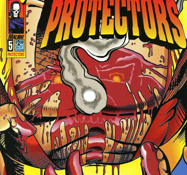
As gimmicks go, it’s an interesting one, but problematic from the very first page, as the art of the comic book wasn’t created expecting a big ol’ hole in the middle of the issue, as we see as the heroes and villains of the book have their respective pep rallies of good and evil…
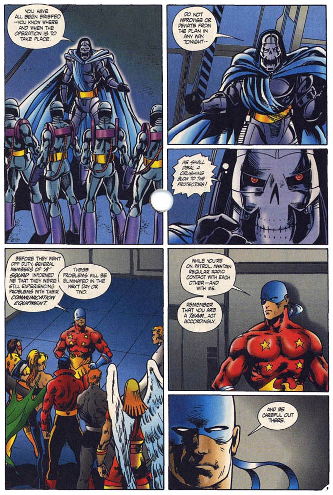
The ‘Be careful out there’ line is an homage to Hill Street Blues, a bit which comes across a little odd to me because of how straight it’s played. It ends up feeling less like an homage or reference than it does an attempt to be meta-clever, undermining the story for me. There is also an ominous note about problems with the communications equipment, a Chekhov’s gun that will have to be fired by the final act. We also get a moment with eager young hero Nightmask…
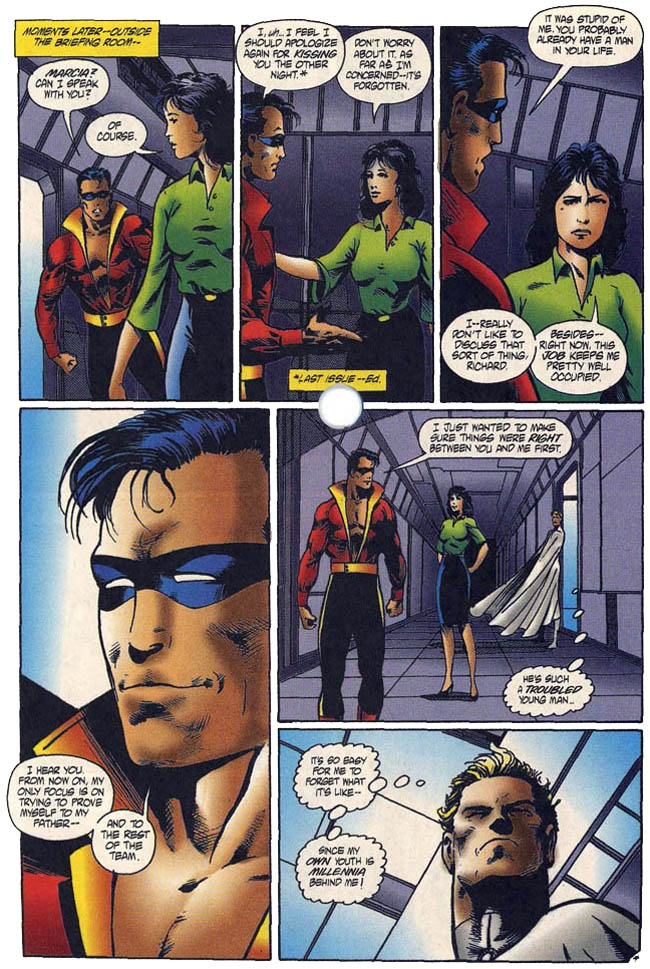
That whole page is what I call a “Goose Moment,” in memory of Anthony Edwards’ ever-so-doomed character from Top Gun. R. A. Jones is a writer that I know I’ve read dozens of issues from, but off the top of my head I can’t pinpoint one moment or arc that stands out. Protectors, being an artifact of the 1990s, also had to have the requisite amount of borderline abusive parent, as we see when we meet Nightmask’s dad, the original Nightmask.
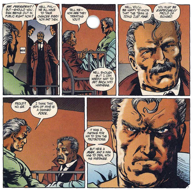
I find it funny that, in his original incarnation, Phil Reinhart was known as The Masked Marvel. The creators changed the named to avoid conflict with Marvel Comics, who likewise have a Masked Marvel among their characters, but changed it to Nightmask, a name that Marvel used during the ill-fated New Universe back in the 1980s. Part of me wonders if Malibu wasn’t TRYING to tweak Marvel’s nose with that choice. In any case, his father’s scorn adds another layer of tragedy to the cloud of doom that follows young Nightmask as he goes about his nightly patrol…
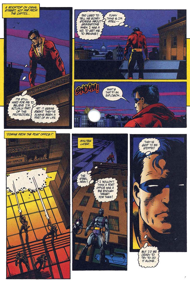
As I read that panel, my fingers resting on the embossed blood gushing from a wound in what is clearly Nightmask’s chest, I started to wonder where the line between foreshadowing and hamfisted emphasis lies. The broken radio equipment rears its ugly head, forcing our impulsive young hero to take on the Steel Army all by his powerless lonesome…
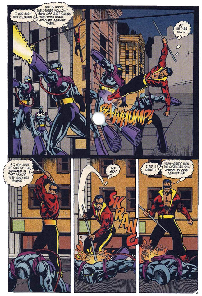
The other armored villains are recalled to their base before they can cut him to ribbons, and I breathed a momentary sigh of relief for Nightmask, even as I knew things were hopeless. Man O’War calls in the troops when his rookie hero goes missing, rallying every one of the Protectors into action to find Nightmask, who has already infiltrated the lair of the villainous Mister Monday. Sadly, this particular bad guy shares more with Doctor Doom than just similar taste in fashion and alliteration: Nightmask has been lured into a trap.
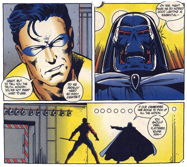
Things are looking bad for the newest Protector, as his teammates (most of whom have been around for decades) flail about desperately to find and save the new guy, while Mister Monday broadcasts his confrontation with the newest Protector to the city’s captive audiences.

I get a little giggle every time I see that big ol’ hole in the middle of the art. It always makes me laugh, for some reason. While Nightmask’s crush tries desperately to trace the signal, and his friends and family look on, Nightmask gets not only beaten, but beaten badly, cut to ribbons by Monday’s weaponry.

Mister Monday gloats, asking if the young hero has any last words for the audience. “I’m sorry, Dad,” laments ‘Mask through a mouthful of blood. The Protectors arrive, busting down the doors of Monday’s deathtrap… long minutes too late.

Y’know, if it weren’t for the big hole in the middle of the page and the complete lack of wounds to account for all the gore, that could have been an incredibly powerful comic page. Even as it is, the sight carries some punch, although the loss of Nightmask doesn’t really have a whole lot of affect on the team. In less than three issues, the surviving Protectors would be bickering, back-stabbing and slap-fighting like nothing ever happened, their book only running until issue #20. Protectors is at least notable in comic history, in that the final issue featured a villain who threatened to blow up the entire world…
…and succeeded. All the Protectors died horribly when their planet literally blew up, which makes Nightmask’s brave-but-dullardly demise here seem somewhat less stupid in context. Protectors #5 tries hard but never quite puts the pieces together, with the drama undermined by a cover that’s both spoilery and detrimental to the contents of the issue, earning a minor footnote in history and 2 out of 5 stars overall. Even so, I kinda love this issue, like you love a 3-legged dog, or your first awful car, if only because it wanted to be something wonderful, but ended up being pure, concentrated 90’s.


2 Comments
I still own this. Strange times, the early 90s. A wasteland of unfinished stories and clenched teeth.
Retro review earns a retro comment.
I sorta hated the 90s and stopped collecting comics at that time. This book/series Definitely exemplifies the 90s, but having now discovered it for the first time, I’m shocked to discover I love the series.
To some of the points of your review:
re. the loss of Nightmask doesn’t really have a whole lot of affect on the team.
I disagree. Are they supposed to dwell on him every issue? All families have loss, and all families go on living. And laugh, and cry, and bicker again.
His presence is definitely a significant, if unspoken, part of the entire rest of the series. Most especially in the form of the female character who takes on his identity.
re. the Hole in the middle gimmick. As 90s gimmicks go. You have to admit it is both Ridiculous and Bad-Ass at the same time. It’s a shock that sends a wild, absurdist message.
And if it mars the interior pages. Big deal. It’s a freakin comic book. So what? It ain’t the Mona Lisa (or Dark Knight). As long as it doesn’t erase a word balloon, or someone’s head, I couldn’t care less.
re. the gore of the last image. the parts around the body seem reasonable to me. But the writing on the wall does seem a little (ok, a Lot) over-the-top. And the statement “Monday Rules” is a bit dumb. But then he IS a golden age character. If the writer was going for a shock message, that one doesn’t work at all. Or at least I don’t get it.
But the finest qualities of the story can be summed up in the three words you cited, “I’m Sorry, Dad.”
After all the shock and gimmicks, and sensationalism, it still remains a powerful story about a
poor, dumb, sweet sonuvabitch who just didn’t know any better and was trying so hard to prove himself.
The writing is what makes this story work. IMHO. And the art is actually one of the better drawn issues of the series.
It both embraces and overcomes the 90s excesses. I’d give it 4 stars and call it a hidden gem.