![]()
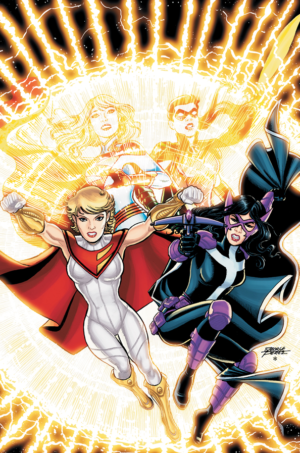
If you were wondering what Power Girl would look like in the New 52, your wait is over as DC Comics has released the George Perez cover to World’s Finest #1.
I honestly expect there to be a lot of negative flack (not on this site of course, our readers are the best, most polite, people on the Internet) over the redesign that removed the Boob Window and reduced Power Girl’s chest size.

Full solicitation should arrive next week from DC Comics.


15 Comments
The “Supergirl” and female “Robin” in the background is interesting. It’s kind of confusing because the facial features of both don’t look like Perez’s usual rendering.
Hooray! The cleavage window is gone! That is one costume redesign I can totally get behind.
XD! Not what most guys would be saying at this point but hey.
I would stil like to get behind her…
I understand the desire to get rid of the boob-window, but this… this is just a bad design. Every part of this design is out of left field: they’re ignoring even the GOOD parts of her old costume for this piece of garbage.
Thumbs down.
Maybe the cleavage window is simply hidden under the cape, and she can still flash it when necessary?
Could it be that Kara and Helena were Supergirl and Robin on Earth 2 and had to change their names on Earth 1?
Adios Justice Society of old.
Yep. :(
I don’t like the capeand lose the gold.
Boob window or no boob window this costume is terrible.
Though I’d prefer a boob window of some kind ^_^
I don’t like the new uniform and it’s not just the lack of boob window– the triangle that the cape forms on her chest and the hairstyle are very 70s.
Why has it taken so long to ditch the boob window? Anyone complaining about it going away needs to man up and just go look at boobs. Seriously, if you have the time to whine about that, re-purpose your energy and go find some boobs online that aren’t behind a window. I hear they have those on the interwebs now…
I was surpised to see this cover was actually drawn by George Perez. While the layout looks Perez, the actual art does not. The faces have a too “cartoony” look to them. And thumbs down on that new Power Girl costume.
Power Girl’s uniform reminds me of Supreme’s uniform. Once again they dropped the ball with a uniform re-design. They should have used Amanda Conner’s as the base especially the boots and cape design . The “window” eh…not sad to see it go but the little triangles do not exactly inspire a great symbol either. Hope it’s temp and a better costume comes.
I don’t mind the loss of the cleavage but I’m not liking the breast reduction. That’s like making Superman blonde. It was part of her character. Why should ever superheroine have the same cup size? I really feel this was a dumb move. There are too many characters that are just reskins of the same body form of both males and females. Powergirl broke that mold and it made her unique.