![]()
Carpet Bomb Comics is a new company, currently in the process of launching itself with two titles. Brian already reviewed Factions #1, but found it not to be to his tastes, so how will Carpet Bomb’s other book fare?
Writer: Erik Hendrix
Art: Ibrahim Moustafa
Colours: Michael Nelsen (Interior), Ibrahim Moustafa (Cover)
Letters: Erik Hendrix & Michael Nelsen
Covers: Ibrahim Moustafa
Created by: Erik Hendrix & Michael Nelsen
Publisher: Carpet Bomb Comics
Our story begins in 1997 when the superhero Cosmicus is killed by a foe in the skies above Austin, Texas. Cut to the present day and there have been allegations by one Congressman Bill Edwards that Cosmicus’ death was part of a government-funded research project. It’s exposited via a news broadcast that in the 1960s there existed for a time a group of superheroes who later disbanded, and since Cosmicus’ death Edwards has put together a new group of heroes. The new group appears to be rather devoid of morality, though, as they are given and carry out a mission to kill one of the old heroes – Dean – a man whose illegitimate son is among the new team. Later another ex-hero named Ken, after hearing of his former-friend’s death, goes and talks to an Aquaman-analogue, unsuccessfully attempting to convince him to help do something about Edwards and the modern heroes.
Here We Go Again
In his review of Faction #1, Brian said that, ‘underneath all of the confusion and seemingly random events, there is a really good story waiting to happen.’ This book, I feel, is the opposite: the story makes sense and is perfectly easy to follow, but underneath it all is seemingly nothing more than a rehashing of a rather tired concept. As of the first issue, I cannot find anything original about this story. It is simply nothing more than the ‘Superheroes used to be noble but now their descendants are morally defunct!’ plot without a single thing to distinguish it from the numerous different versions that have gone before it – except, perhaps, for the fact that it doesn’t even try to put any sort of new spin or twist on the concept.
Praise where praise is due, though: despite the unoriginal plot, the dialogue is well written and the plot does work (in that it makes sense and is structured fairly well). In fact, the dialogue was a personal highlight – it varied between characters and it felt like each of them, for the most part, had their own individual style of speech. I could definitely tell the characters apart by the words they spoke and this played a large part in making the people, and the book, more believable for me. It is a pity, then, that most of the characters are more-or-less DC analogues and, given the writer’s apparent talent for making the characters distinguishable, I feel that a huge opportunity was missed here to vastly improve the book by giving us some fresh and interesting personalities. I also want to bring up a very minor quibble: the title may be misspelled. Yes, I realise how small an issue this is, but the title is ‘The Guilded Age’ – obviously, the normal expression is ‘The Gilded Age’, and I can’t tell if this is something intentional that really doesn’t come across or if it’s a misspelling.
Some Small Distinction
The art, at least, distinguishes this book from its myriad competitors. It’s fairly well drawn, although I wouldn’t say it was brilliant art, but what it does do well is keep its own style without being overly stylised (and thus loosing appeal for some) – this is something I also think that Irredeemable does very well. Whilst the art turned me off when I first saw it, it has grown on me during my read-throughs, and I’d say its one of the better aspects of the book; that said, it’s not the kind of art that would have me immediately picking the book up off the shelves.
There are also some questionable colouring choices, namely in the fight between Dean and his illegitimate son. Both of them wear a similar costume, but they are distinguished by the fact that the son’s suit is a light colour, whilst Dean’s suit is dark. However, this scene takes place at night and sometimes the two suits are coloured similarly, making it difficult to tell the two characters apart (as, being father and son, they are drawn alike) and making the scene confusing at points. The fight scene also does not do particularly well on the sequential art front, and the whole section feels static at times and doesn’t really flow.
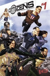
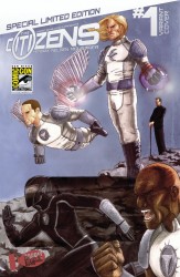
Both covers are drawn by the same artist as the interiors and so, on the good side, they are an accurate representation on what you can expect from the art throughout the book. The regular cover showcases the old heroes and the variant sports the new, and both are fairly bright and colourful, so it seems as if an attempt has been made to capture the readers’ attention, which I like. However, both covers are fairly standard group shots and, seeing as a first-time reader won’t know who these characters are, they’re pretty meaningless.
Two out of Ten for Trying
The bottom line I’m trying to get at here is that when you start up a comic book company, you really need to make a name for yourself quickly. You need to grab people and show them something new and exciting, and get people like me typing away sentences like, ‘Have you seen this new company? They’re doing things no one else is!’ This book doesn’t even seem to be attempting to do that. Being technically well written or well drawn is not enough when you have a story that has been done umpteen times before and you have not made any attempt to innovate on it or make it your own. Last week I reviewed Widow Warriors #1 and didn’t give it a particularly good score, but at least that book was something a little different, a little outside of what we normally see and, despite its flaws, I have something of an affection for it. The Citizens #1, by contrast, is just bland and I’d rather read something like Widow Warriors over it any day.
I cannot recommend this book: you will find no new experiences here, nor will you find existing experiences done better than before. If you want to read this kind of story than there are better examples to be found elsewhere, and whilst this version is decent enough it is not worth pursuing above other similarly-themed books and, as such, I feel that I cannot give it more than one star out of five.


