![]()
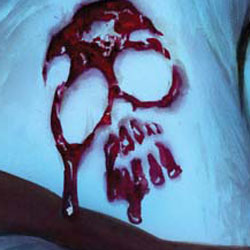
They’ve murdered his family, they’ve burned his lands, and they are stealing his company out from under them. When you’ve lost everything, there’s nothing to hold you back, and for The Phantom, swift justice is the order of the day.
 THE LAST PHANTOM #3
Writer: Scott Beatty
Illustrator: Eduardo Ferigato
Colorist: Vinicius Andrade
Letterer: Simon Bowland
Covers: Alex Ross, Joe Prado, Faviano Neves
Editor: Joseph Rybandt
Publisher: Dynamite Entertainment
Previously in The Last Phantom: In an attempt to become all powerful, Peter Quisling orders the deaths of Kit Walker, his family, and the prime minister of Bangalla. But Kit Walker is the man who will not die, and he’s out for revenge…
I’M COMING FOR YOU
I know there are some Phantom fans that absolutely hate this series because it places The Phantom in a revenge movie that is very graphic and over the edge. In an age where John McClane, Rambo, and Nazi hunters can hack, slash, and burn their way to satisfaction, bringing The Phantom into this world tends to make him more relevant to new readers. Personally, I like that he doesn’t hold back and is willing to the eye for an eye route.
This issue finds Kit regaining his strength and taking out those that killed his wife and son. The method he goes about it – using paint guns to identify those wearing invisible uniforms shows he can plan an attack. His brutal beating of the head of Kreighund proves he can kick some major ass. When he rigs the Kreighund warehouse to explode with the leader inside, he let’s readers know he is one bad mutha. And his phone call to his former friend and colleague Quisling at issues end, sends a shiver down the spine, as readers instantly know Kit will not stop.
Beatty also creates some softer moments with Walker that shows compassion to his friends, and we get to see that his network of operatives is quite large. Those not familiar with the character’s vast history, pretty much know all they need to know about the the resources available to the hero.
The pace of the story is fast and furious, and there are a few moments that need to be read again in order to figure out how it fits with the mythos and the overall build of the story. If you haven’t read the first two issues, you will be lost, so now is a good time to grab the back issues from your local comic book shop.
VIOLENT ART IS NOT SO VIOLENT
Previous issues have really gone over the top when it comes to bloody fighting and overall levels of violence. In this issue, readers only see one decapitated head, and the busted face of the Krieghund leader. Ferigato does a decent job with the art in this issue. The gore is not too over the top, and it kind of comes off silly in places as the new leader of Bangalla walks around with a head as he rants about The Phantom.
I really do appreciate it when artists mix up their camera angles, and we get to see the world from another angle other than the one that is between 5’5” and 6’5” off the floor. Coloring adds to this as lens flares, reflections, and those little pings that come from light hitting the subjects and their surroundings just right. That being said, the coloring does come off rather rushed at times with smudges of color instead of something that looks more planned and highly rendered.
BOTTOM LINE: CHECK IT OUT
With the proliferation of old heroes coming back to comics, and the current state of the economy, readers are being more selective when it comes what titles they choose to read. The Phantom is a great revenge tale wrapped around a classic hero. The story by Beatty moves along at a very rapid pace, which is refreshing. The art is good, but a little more attention to coloring would easily make this a more attractive bit of eye candy. The issue is worth checking out, and earns 3 out of 5 Stars.


1 Comment
The more I see Alex Ross art, the more I hate it. I hate that all of his pictures look either like the characters were inside a roller skating rink when they kicked on the black lights or like they should be made up on black felt and again viewed under a black light. Argh! I used to like his art, but this eerie blue and the sickly yellows, and lets not forget about the roofied/about to pass out shades of pink and purple that all of his pictures are tinted with. I’m cool on the semi-photorealistic style, it’s the coloring of his art that really irks me.