![]()
This book, beginning a new mini-series from Minotaur Press, caught my eye this week with some creepy visuals and distinctive art. How did it turn out? Find out after the jump!
 Echoes #1 (of 5)
Writer: Joshua Hale Fialkov
Art: Rahsan Ekedal
Letters: Troy Peteri
Editors: Filip Sablik & Phil Smith
Cover: Rahsan Ekedal & Rob Schwager
Published by Minotaur Press (of Top Cow Productions)
A Grisly Discovery
So, the plot of this issue revolves around one Brian Cohn. His father, on his death bed, beseeches him to go to a certain house, mentioning something about, ‘the bodies, the girls bodies.’ Brian goes to the house, and whilst there some creepy things begin to happen. A ghostly man walks behind him, just out of sight. Brian is also on medication for paranoia, and is late in taking his pills, so in the house he is also fending off hallucinations. Not wishing to spoil a great reveal, I’ll suffice it to say that the issue ends with Brian finding something most grisly in the basement.
I would like to start off, funnily enough, by talking about the reveal at the end of this book as to what exactly is hidden in the basement of the house. I still won’t spoil it, but I’ll just say that it is something of a shocker, which is saying a lot seeing as I was already expecting something unpleasant to be down there. It is a well-done moment, and it’s sure to disturb you at least a bit.
The rest of the comic is also of good quality – this first issue sets up an interesting premise, and it’s one that I want to follow. Fialkov does a good job of getting us in Brian’s head as he walks around this creepy house, not quite knowing what he’s doing there, whilst he attempts to find off hallucinations just so he can get out of there and go and take his medication. It was compelling stuff, I found, and what’s more the book manages to convey a genuine sense of creepiness – that old abandoned house has a real, and unpleasant, presence, and praise is really deserved by both the art and the story for creating this. As I was reading the issue it almost felt as if I was watching a horror film – it has the sort of cinematic pacing that creates that effect, and I think it really works in favour of the book.
I could criticise this book for not having a very original plot – a son has to dig up his father’s dark past, after all – but the execution is so good that the book managed to be very entertaining in spite of that. Most importantly, whilst reading I did not get that horrible sensation of having seen it all before, and so, in my book, this issue succeeds in the plot department.
Art that Knows what it’s Doing
This book also very much succeeds, I feel, in resisting the temptation to overuse words. This really feels like a book in which the writer and the artist have worked together to let the art do as much as it can, and to keep works to a minimum, and this is something that I really love. Top marks in that area.
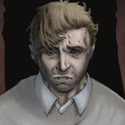
The art is in black and white, and does a great job of created that aforementioned creepy atmosphere. For one, it makes excellent use of light and shadow inside the house to create an oppressive feel around Brian, as if some malevolent force is closing in on him, and as if the darkness represents Brian’s mind, which is gradually becoming more clouded. The art has a realistic look to it, as well, though, and it is not so stylised as to put people off. It is also worth mentioning that Ekedal makes the things that Brian finds in the basement look very unsettling, greatly adding to the effectiveness of that moment. I thought the facial expressions were mixed in this book, though. Whilst sometimes they can be rather good, at other times they feel a bit off, at times over-done, and at others they don’t seem animated enough. It’s an unfortunate point for otherwise-good art.
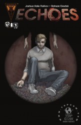
The cover is also great, in my book, featuring Brian lying on a pile of small doll-like things (which do have relevance in the book), whilst an unknown figure looms behind him. All this is in a circle in the centre of the cover, whilst the rest is in black, recreating that oppressive blackness used so well inside the book. This cover earns much applause from me: it features elements from and reflects the content of the book, is intelligently put together, and it is well-drawn. The colouring is also of noticeably good quality, and whilst I do still like the black and white of the interior, it would have been most interesting to see the entire book coloured like this.
A Little Bit of Creepiness in the Christmas Season
This book was a very pleasant surprise: it caught my eye with impressive visuals and then followed through with an overall-quality book, which was much appreciated on my part. It’s got an interesting premise with a very effective execution, so if you’re a bit fed up of all the holiday cheer this time of year, and you fancy something a bit more macabre instead, then I recommend you pick this up, because it gets a big four stars out of five from me.


