![]()
Do you like robots? In the future? Well, has BOOM! Studios got a book for you…

 INSURRECTION V3.6 #1 (OF 4)
Writers: Blake Masters & Michael Alan Nelson
Artist: Michael Penick
Colourist: Darrin Moore
Letterer: Travis Lanham
Cover Artists: Karl Richardson (Cover A), Rael Lyra (Cover B)
Editor: Dafna Pleban
Publisher: BOOM! Studios
Price: $3.99
A Good Sense of Place
The book is set in the year 3000 CE*, and at this point Earth has become a utopia. However, off-world wars are still waged for resources to keep that utopia alive. These wars appear to be fought using ‘auts’ – machines made to look like humans. The book focuses on a certain ‘T.L. Model 3.6-195’ or, ‘Tim’ as he comes to call himself. This aut is established to be different from the others – he asks questions about his existence and the way of things etc. Tim is being sent to the planet Sparta, recently taken from some other company, to replace a T.L. unit that has been destroyed. Also on his way to Sparta is Hal, a human who is going to fill some important position there. Long story short, Hal insists on taking a tour of the mines, even though they are not yet safe, and our issue ends with him activating a trap left by the previous owners, whilst accompanied by some friendly auts, including Tim.
This book was an interesting read for me. Initially, the plot is quite generic: future war, robot soldiers, one of them starts to question things, we’ve heard this all before. However, the issue, through a combination of writing and art, manages to create a real sense of place, of a universe at large, to the extent that I was drawn in and my interest was maintained until the end of the book.
The first third or so of the book is dedicated to an opening sequence where an army of auts take the Sparta facility; whilst opening with an action sequence is a good way to draw the reader in, and the sequence itself is pretty cool, it features none of our main characters and, as a consequence, we don’t meet Tim until page eight, and as such we as an audience are not given as much time as we would, perhaps, like to get to know him and care about him by the end of the issue, when he is placed in danger. My second major problem is far more specific, and it revolves around one scene in which Hal encounters a female aut (a model, it seems, that is designed to be attractive) and he is enchanted by a tune she is humming. This does not work – we cannot hear the tune, and so we cannot understand why Hal is so bewitched. Writers, take note.
Tim is a very run-of-the-mill character, and rather uninteresting for it. The character of Hal, however, interested me much more. He appears to be a man who has left a utopia in search of adventure, a man who, perhaps, even resents his family for them tying him down. This is a conflict, and a journey, that I can get emotionally invested in, and it is a pity, then, that Hal is put into the role of the stupid bureaucrat by the end of the issue, bumbling into a trap. I can only hope that, in the future, the former part of his character will be emphasised over the latter. The dialogue in this issue was also very good, always feeling natural, and even extended conversations flowed well.
Some Knock-Out Art
The art is what I really enjoyed about this issue, and contributes more than anything else to that aforementioned sense of place. It has a kind of retro look, in some panels (particularly in close-ups of faces) it looks like some exquisite 1950s illustration; on that topic, I really enjoyed the panel layout, which incorporated, on occasion, small circular panels that gave us a close-up of a character’s (or characters’) face, in a manner that works extremely well. The faces themselves are also a joy to look at, the characters, at times, seeming so alive that I was really impressed. The colouring is also a joy – bright and vibrant, it brings a real life to the art. The palette also swaps somewhat between locations, and the colouring manages to give each locale a distinct feel.
There are only a couple of downsides to the art that I could find: firstly, the opening battle sequence has some problems with flow. Whilst it is certainly possible to work out what is going on, at times I had to pause to figure things out, and this rather acted in opposition to the atmosphere of the sequence. Secondly, there are a couple of panels of cheesecake-y art, which may or may not hinder your enjoyment of the book.
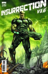
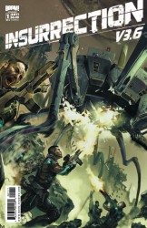
As for covers, Cover A shows Tim standing in some warzone, on top of some fallen machine, with buildings and a green sky in the background. For starters, the place he’s in doesn’t look like any location in the book, nor does he really fight anything this issue. However, the colouring might help it stand out on the rack, and the title looks pretty good. Cover B shows some soldiers fighting one of the large machines from the book, so it immediately beats Cover A in terms of relevance. This cover is also really well-drawn and looks quite impressive, and although it doesn’t really have that much to do with the plot or characters of the book, neither does the first third of the book itself.
Worth Checking Out
Overall, this was a good read – the art is excellent and, although the writing has a couple of problems, it’s not anything deal-breaking, and as such I award this book three and a half stars out of five.
*That is how the book expresses it – CE stands for common era, and is used by some people today as a stand-in for ‘AD’, but I suppose the ‘common era’ could mean anything within the book.
P.S. Blake Masters is an awesome name.


