Sony Animation is set to release the Academy Award winning Spider-Man: Into the Spider-Verse on digital February 26, 2019 and on blu ray March 19, 2019.
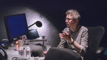
Last week our own Ashley Victoria Robinson was invited to the studio to interview many of the creative forces behind this major motion picture and some of the special features that will be appearing on the blu ray – including Danny Dimian, the VFX Supervisor on Spider-Man: Into the Spider-Verse.
DANNY DIMIAN: I’m the Visual Effects Supervisor and most [people]know what that is, but the easiest way  to explain that, it turns out, is the Head Coach of the Creative Team that does this.
Where did we star? How did we get to what you finally saw? What were our creative goals and rules? Well, right away we crossed out “rules”. What was really special about this is everybody held hands from the very beginning – execs, directors – with the goal of trying to find a new visual language. Trying to make something people had not seen before. Chris [Miller] and Phil [Lord] would often say that not only did they want to see something they had not seen before – they didn’t want to know how it was made. Push it that far. That was the hopes and dreams of this.
Now that’s a rare freedom and not all of the artists were used to that freedom. We started introducing people to [Spider-Verse] with one of the themes of the [movie]: everyone can wear the mask.
That wasn’t strong enough for the artists.
We ended up with this slogan and we kept repeating it: if it ain’t broke, break it.
Meaning: push things to a point where you think you’ve gone too far, it’s no longer working, let’s see if there’s something special in that. Those are some things that we kept referring to. That freedom was really inspiring.
Speaking of inspiration: where [did]we start? Well, there was something special about the original comic books, so we went back and we looked at the comic books. You know, this is where everything started. What was special about it there? What did we want to try to get from there? Well, they’ve got really graphic design. They’ve got really, incredibly strong posing. They’ve got vivid colours. In addition to that, there’s a different way to tell a story. There’s multi-panels. There’s text on screen. There’s the BOOMs and BAMs. There’s a whole language there that we wanted to experiment with. The more we looked at it, though, there’s three things that kept coming up for us that we wanted to try to put in the movie. And, again, at this point, we have no idea what we want this to look like. We just know what our inspirations are.
There was something special to the printed book. The half-toning. The illustration quality. So, we wanted it to look like a printed comic book in some way. What made it special was all those imperfections. Some of the imperfections from the misalignment of the printing, some of it from how it was drawn. We really wanted the hand of the artist back in CG. Then, generally, art over realism. So, printed comic book. Hand of the artist. Art over realism. We kept repeating these things to ourselves when we didn’t know where we were going, but we were starting.
We knew early on that the lines were going to be important for both expressing the characters and for the look and feel of the movie. We didn’t want to be limited by comic books. We looked everywhere … we were looking to build a new language that was born of the comic book world.
Let’s start with New York City: it’s one of the most important environments in our movie. We’re going to spend a lot of time there. Our art department went to New York City. Location scouted all the places that we wanted to represent for New York, but that’s just the starting point. That’s the literal New York. We need to make it look like our movie. Like our hopes and dreams.
… Another expression we coined on this movie: if we do enough beautiful things wrong it will all feel right.
And, so anytime there was something that would be considered conventionally wrong, but was beautiful we kept. We didn’t know how we were going to use it, but the concept was kept.

… I want to talk a little bit about the level of detail. When you see illustration, illustrators and comic book artists use the simplifying of objects to tell you something like where to look and also to stylize and make environments and backgrounds and mood feel much more interesting. So, throughout the whole movie you’ll see things that are purposely either reduced in detail or completely abstracted so that it feels right, but it’s a little nonsensical.
… I was talking earlier about how we really didn’t know where we were going. We really didn’t know what we were doing. All we knew was that we wanted to try everything. Everytime we found something cool we put it aside knowing that’s a part of the language that’s all going to fit.
… When we start to feel good about the environment we can start to focus on characters. Now, characters have been evolving this whole time. I don’t want you to think we did environments first and characters were just the last thing to come together. They were the hardest thing to make fit and look right and to stay emotional. We knew from the beginning that those characters were – we wanted them to be stylized. We wanted them, again, to look like something people had not seen, but there’s a design problem. If you go too far with characters people start noticing shapes moving and swimming on the face and everything has to fit and stay locked to the character in a way that, maybe for the first few shots you’re like, “Wow! That’s really cool! What is it?” but then that has to go away. It has to feel right. You have to be focused on the emotion of the characters.

… [Now] let’s talk a little bit about the effects. We’re going to make a superhero blockbuster. We’re going to blow things up. There’s going to be a lot of effects in this. And, again, we’re concerned a lot about simulation feeling too real or not being artistic to fit in here. So, we start small and we’re applying the same rules (Keep it graphic. Keep it simple. Interesting colours.), and we’re applying the anima[ation]principles here: we’re animating on twos.
… [Early concept art was] not feeling quite right here. It’s feeling a little too simulated. It’s feeling a little too much like we just processed simulations and it’s not enough. So, we start working with 2D animators to animate – actually animate by hand – 2D animation cycles. Now we’re onto something with this, but we have a lot of effects. This is going to do the heavy lifting. We built libraries of this kind of animation and, for hero moments, these are fed into – and glued together – with a lot of other simulation and together it all just works. We’re really loving this and we’re extending it and in some parts of the movie we’re going pretty far and we’re making it really graphic.
If you step through everything in the movie and you’re going to get something that could be an interesting frame and sometimes they’re subliminally stuff you’re feeling … there’s stuff that you’ll feel subliminally that you don’t even see. If you do step through the blu ray you’ll see all these interesting little tidbits that you may not notice.
[During the end fight] there are these flash frames. There’s all these cool little moments in there. It’s what people are feeling and, again, the blu ray – you can go through it – there’s so many frames nobody knows are there til you go frame-by-frame. It’s pretty cool!
You talked about how: if it’s not broken, break it – but you have a plot point in Spider-Verse where reality is literally breaking. How do you reconcile that?
DD: Right, so, we thought we’d gone to 11 too soon because we had done all of this before the final sequence where we had the final battle. I think there we do a couple things: the palate goes completely crazy – we’ve got the palate, we’ve got action, we’ve got a depth of stuff that hopefully is not confusing because we still want the emotion, but we have so much going on. Again, it’s rooted in a palate and activity that is just not normal.
There are moments where the music and the action synch up. Was that something you had to account for later in production?
DD: Most of the score is done after. We planned for that. Now we wanted to keep the story open as long as possible, so sometimes there was a back-and-forth. They would rescore to something or make a change
Dear Spoilerite,
At Major Spoilers, we strive to create original content that you find interesting and entertaining. Producing, writing, recording, editing, and researching requires significant resources. We pay writers, podcast hosts, and other staff members who work tirelessly to provide you with insights into the comic book, gaming, and pop culture industries. Help us keep MajorSpoilers.com strong. Become a Patron (and our superhero) today.


1 Comment
Insightful. Best movie I saw this year.