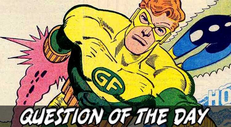
Like so many of the rules of being a superhero (cape, secret identity, the whole “tights like a carnival strong-man” thing), it all started with Superman: His S-Shield may have evolved from literal shield to weird inverted pentagon thingy over the years, but it has generally looked really cool and always recognizably been the letter S for Superman. Not everyone has it so easy, though; Geo-Force’s chest-symbol redesign always felt tacked on and many modern stories only use chest letters to denote that a character is meant to be retro or old-fashioned, leading us to today’s typographical query…
The MS-QOTD (pronounced, as always, “misquoted”) also says, apropos of nothing, that the “On my world, it stands for hope” explanation is cute, but once again over-thinks the matter and answers a question nobody asked, asking: Superhero Chest Letters: Way Cool or Way Too Old-School?


4 Comments
It depends. When you have characters like Superman or Daredevil with cool stylized letters, then yeah it is cool. But then you sometimes get awkward chest letters, like Geo-Force as you pointed out.
In theory, I don’t mind chest letters (or letters in other areas like Captain America’s mask or on a belt buckle or something). But not EVERY hero needs one, nor would it work for all heroes. Even symbols don’t always work if it looks tacked on, and letters follow a similar principle as most are stylized and not just a plain letter. But if well done, it can really make a costume pop.
It depends on costume to me. Some combinations work better than others. But yeah, usually its the older ones where it works better.
I think you have to go on a case-by-case basis. Some characters, it totally works for. Others… maybe not so much. Superman, yes. Spider-Man, no. And if you have a symbol, ala Green Lantern, where does that fall on the spectrum?
Even Galactus had a chest letter at first. (And a purple skirt.) He turned out ok.