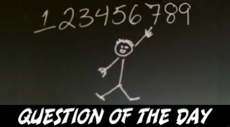
Recently, while I was writing a check in front of my wife (which I’m aware marks me as an anachronism from the mid-1990s to begin with, especially in the new ‘swipe your card and run’ world), said beloved partner of twenty years took the time to cruelly mock the way I write my sevens. Because of the way I was taught to draw number one, I have a tendency to put a cross through the middle of the body of the 7 to keep it distinct. My lovely wife has deemed this to be “goofy”, regardless of my protestations of handwriting clarity and good bookkeeping, and (in the interest of marital harmony) I let the matter go. But, Faithful Spoilerites, since she doesn’t read the site every day, this is your chance to unite and help an internet brother out (unless you also think I’m goofy, at which point this whole MS-QOTD will never have happened) which leads us to today’s numerically lucky query…
The MS-QOTD (pronounced, as always, “misquoted”) reminds you to remember what Clint sang about Mahatma Gandhi, The Pancakes and The Dragon, and maybe that cartoon rabbit from ‘Schoolhouse Rock’, asking: Do you cross your sevens?


10 Comments
Of course I do. Its necessary because many people write ones either with or without that small thing on top. Cross line in “7” makes it easy to tell them apart.
I used to until middle school when my teacher threw a HUGE fit over it, how I drew 1 (which was like the one in the image) and that I used the “&” symbol in writing.. Imagine a two-year-old throwing a temper tantrum for not getting a toy, and then imagine that two-year-old is instead a 50-some woman and you’ve got the gist of what her fit in the middle of class looked like. Even though the teacher was let go at the end of the school year, the whole thing freaked me out enough that I never switched back.
I had a friend who used to put the cross through his 7s, and I thought it was weird. My own trouble came with how I drew my 4s. I used to close the top (like the Fantastic Four did!) by a math teacher told me to stop it, so I’ve been drawing open-top 4s ever since.
As a math major in college, I cross my sevens. Since we used variables a lot, I constantly was confusing my sevens and z’s and twos. So my sevens and z’s got crosses to tell everything apart.
Not only do I cross my 7’s but I put slashes through my 0’s to distinguish them from the letter o. That can be just as frustrating as the 7 to 1 scenario. I’m with you brother.
Occasionally I’ll cross my 7’s but I have to cross my zeros and my zed’s
I always cross my 7’s. And I usually slash my 0’s too.
I will only slash zeroes in a computer-writing format, for some reason…
I change the way I write letters and numbers based on my mood. Sevens have only recently entered the mix. I only cross my sevens if I am also slashing zeroes, which only happens when I’m writing out a figure with o’s and 0’s.
So to answer your question, yes?
My other alternates include 2’s, D’s, and A’s.
But all my n’s, u’s and r’s tend to look the same.
When I read through all these posts it brought back memories of various teachers and my mother attempting to make my writing legible (and it is very much so now, but learning Calligraphy on my own did that). I cross my 7’s. I was always told this was a “French seven” and as an English speaker in in French Immersion schooling, I went with it. But I also liked how it made it easy to tell them apart from my 1’s (which lets be honest over time have morphed into a simple line).
I was also regularly scolded for closing my 4’s up, most of the time they are now open. And I strike out my zeros. From doing data entry, working on algebra and statistics, and even from a book keeping POV; if you are going to write something out rather than use the programs available to you on the computer- strike out those damned zeros! Anything where a tiny detail can make something 100% more easy to read at a glance is very worth it. Why do you think Times New Roman is such a popular font? I believe they call them kerns and ligatures, the little tiny details make it an eminently readable font. Typography grew out of hand writing, printing and calligraphy.
I’ve seen samples of Mr. Peterson’s handwriting. Its beautiful, unique and legible. What does she really have to complain about? tsktsk!