When Jerry Siegel and Joe Shuster ushered in the era of the superhero back in 1938, one of the major conventions was a big bold S across our hero’s chest, marking him as more than just another wise-cracking detective or two-fisted P.I. Of course, that symbol has been through a LOT of changes in the ensuring seventy-odd years… Welcome to Ten Things!
Whooshman-Bicarbonate Films, in conjunction with ‘An Amateur Comics Historian’, and ‘Martha Kent’s Sewing And Craft Emporium’, Presents:
TEN ITERATIONS OF THE SUPERMAN SYMBOL!
10) THE ORIGINAL SHIELD
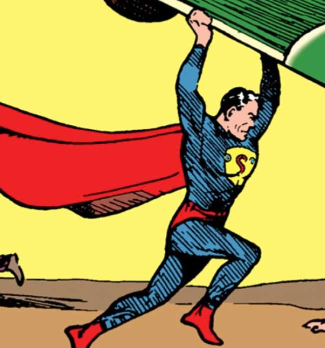
As I’ve mentioned countless times, (Hello, Future People!) I didn’t start reading comics until my early teens, and at that time I always wondered why they called his symbol a “shield.” Now, I suspect it’s a throw-back to the earliest days of the character, where it was literally a shield, in the style of a policeman’s badge. This earliest iteration doesn’t stick around for too long (indeed, the first dozen Superman appearances show the shield constantly evolving), but it’s appearance on the cover of Action Comics #1 makes it one that a lot of people remember. Interestingly, not long after, Simon & Kirby created The Guardian, who carries a similar police-badge style shield as his signature weapon…
9) THE FLEISCHER CARTOONS BLACK SHIELD

Interestingly, one of the alterations of the shield (seen on the left on the cover of Superman #4) showed the “S” in red on a black background, while keeping a slightly altered triangular shield shape. This version influenced the Fleischer Brothers animated version of Superman, which introduced a very important of Man Of Steel mythos: The now-traditional diamond-shape. Interestingly, though the black-background shield was relatively short-lived inside the comics, it appeared as a corner box on the covers of Action Comics all the way through 1946.
8) THE 1950s GEORGE REEVES WIDER SHIELD
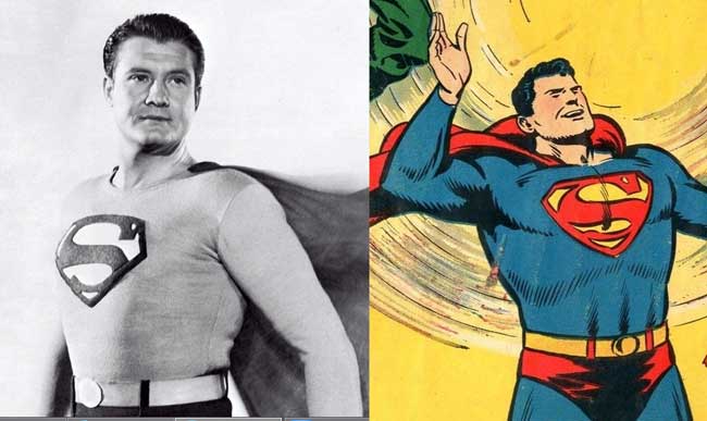
With Superman’s increasing popularity solidifying him at the top of the superhero heap, his chest symbol was finalized and standardized, and by the end of the 1940’s had evolved into its longest-lasting iteration. 1950s Superman artist Wayne Boring is a fave-rave of mine, thanks to his barrel-chested Superman, which naturally gave him room for the largest version of the s-shield seen to date. George Reeves’ television version is similarly thick-limbed, and his costume features a slightly more-square but clearly Boring-inspired shield. (Apropos of nothing, the original black-and-white Superman episodes used a brown-and-gray suit to better convey the red-and-yellow comics color scheme, before going full-color in 1954.)
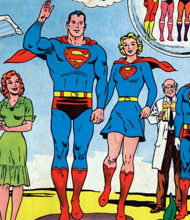
7) THE COMPACT SILVER-AGE SHIELD
Interestingly, the Silver Age version of Superman features pretty much the same s-shield, albeit slightly smaller and more rounded at the edges, with new signature artist Curt Swan delivering a slightly less-bulky version of the Man Of Steel in perhaps his most iconic era. The vast array of super-hangers on (Beppo The Super-Monkey, Comet The Super-Horse, Supergirl and more) in the Silver Age all have this slightly-rounded version of the shield as well, which raises the question of whether fitting it on smaller creatures’ chests had anything to do with the size-change. (There is also a distinct possibility that I’m over-thinking this.)
6) THE INFAMOUS CELLOPHANE THROWING SHIELD
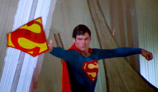
The Superman movies of the late 1970s featured a more triangular base, with straight edges in place of the slight curves of the Silver Age, and expanded the symbol vertically and horizontally to cover more of Christopher Reeves chest-area. They also gave us the completely inexplicably use of the symbol as makeshift shackles to stop the attacking Phantom Zone criminals in their tracks…
…for about 15 seconds. To be honest, I’m waiting for someone like Geoff Johns to make this power an official ability in the pages of the comics, closing a 35-year-old loophole and giving folks one fewer thing to complain about on the innernets.
5) THE EARTH-2 VARIANT SHIELD
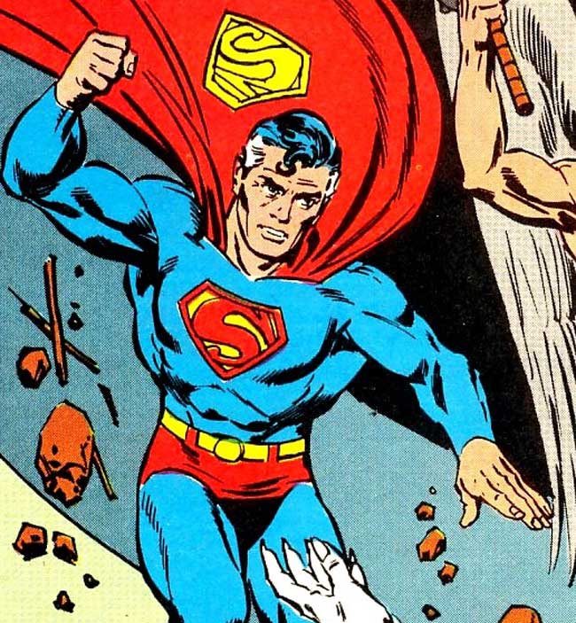
With the establishment of the Earth-1/Earth-2 divide in the 1960s, many short-lived bits of original Superman lore (such as The Daily Star and other bits of early-installment weirdness) were established as the status quo on Earth-2, including this version of the s-shield, which was mostly phased-out by 1941. When the Justice Society returned for full-fledged stories, such as the Infinity Inc. ongoing title, this shield was used to visually differentiate the Earth-2 Superman from the Earth-1 version, all the way through the end of the Crisis On Infinite Earths, when he left the newly-consolidated universe for good (or until DC editorial got tired of no longer having a multiverse.)
4) JOHN BYRNE REVAMP FULL-CHEST SHIELD
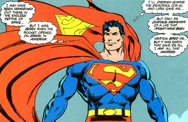
John Byrne and I share something in common: As children, we both looked at the yellow negative space of the shield and saw two fish swimming opposite directions, rather than an ‘S.’ Byrne’s revamp of Superman circa 1986 gave us the largest chest symbol to date, with sharper edges and more defined “edges” at the top and bottom. The upper serif of the S is also given a more angular v-shape, which stuck around for nearly a decade…
3) ELECTRIC SUPERMAN LIGHTING VARIANT SHIELD

You may mock Lightning Superman, but the big problem with the character wasn’t in the costume design, it was in the colors: The choice of a strange aqua blue, even for his skin, makes for a slightly silly, retro image. In contrast, Superman Red (after his energy form was prismatically separated into two different energy selves) makes the concept sorta-kinda work, with its sharp-edged lightning shield looking cool enough that DC essentially cribbed it for use on the New 52 Supergirl costume in 2011.
2) THE KINGDOM COME-ERA BLACK SHIELD
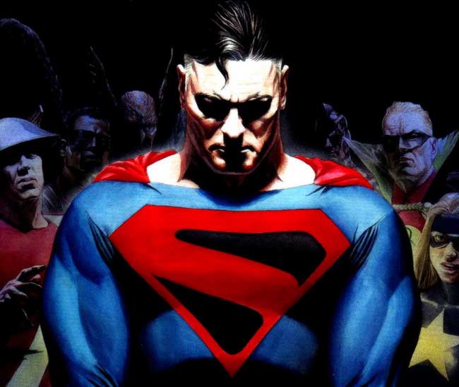
The black background has reappeared a number of times in recent years, including Darwyn Cooke’s ‘Silver Age’ miniseries, but it’s most often used to signify that Superman is in mourning or, in the case of ‘Kingdom Come’, that he is questioning his own better nature. Alex Ross can be a problematic designer for me, but his futuristic, stylized-s is one of his better design choices, and serves as a warning that Superman has changed his attitude. It’s really a shame that DC editorial chose to brutalize that particular dead horse in the pages of Justice Society Of America a few years ago…
1) THE NEW 52 ARMORED SHIELD

While I’m not a fan of all the changes to Superman’s costume after the Flashpoint event (an armored Superman seems unnecessary and perhaps a bit too paramilitary for me, while all the seams and the collar make all the new Justice League costumes look a bit too homogenous for me), the 3-D element of the Superman shield is kind of neat. The upper serif of the “s” is more vertical, losing the v-shape, while the lower bump serif is (inconsistently) removed from the shape. While I still miss the red trunks breaking up the blue field of the suit, the raised edges of this s-shield are visually interesting and help to differentiate it from previous symbols, ala the Earth-1/Earth-2 differentiation of the 1980s.
Feel free to follow along (@MightyKingCobra) for more Ten Things madness on Twitter! As with any set of like items, these aren’t meant to be hard and fast or absolutely complete (so please don’t tell me about the ones we didn’t cover by starting off with “YOU FORGOT!”) but feel free to bring up any favorites that didn’t make the cut. The comments section is Below for just such an emergency but, as always: Please, no wagering!
[signoff predefined=”PayPal Donation” icon=”icon-cog”][/signoff]


4 Comments
Curt Swan all the way. Seeing that symbol on the white leather cover of my grandparents silver age Superman anthology still gives me nostalgic chills.The back cover on “The Great Superman Comic Book Collection” http://www.ebay.com/itm/1981-The-Great-Superman-Comic-Book-Collection-TimeHonored-Classics-Hardcover-HC-/301614596512?pt=LH_DefaultDomain_0&hash=item4639a181a0
Byrne Superman still appeals to me to this day.
Agreed. It’s still the archetype, in many ways.
The Fleischer Brothers cartoon was my first exposure to Supes, so I have a soft spot for that shield, but I do enjoy the 3D-ness of the New 52 one.