![]()
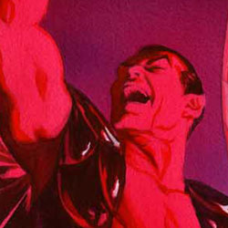
Marvel sent Major Spoilers a sneak peek of Invaders Now #1 from Alex Ross and Christos Gage.
INVADERS NOW #1 (JUL100588)
INVADERS NOW #1 BUSCEMA VARIANT (JUL100590)
INVADERS NOW #1 GRANOV VARIANT (JUL100589)
INVADERS NOW #1 ROSS SKETCH VARIANT (JUL100591)
Story by ALEX ROSS & CHRISTOS GAGE
Written by CHRISTOS GAGE
Penciled by CAIO REISS
Cover by ALEX ROSS
Variant Cover by SAL BUSCEMA
Variant Cover by ADI GRANOV
Sketch Variant by ALEX ROSS
For the first time in decades, the original Invaders are alive and active at the same time. When a mysterious force from the past brings the Invaders together, they must do battle like never before! Featuring Captain America, Namor, the original Human Torch, Steve Rogers and more, Invaders Now #1 brings back this incomparable team for an all-new adventure!
Invaders Now #1 arrives in September and features a $3.99 cover price.


11 Comments
The original Invaders series was one of my favorite comics, almost as much as the All Star-Squadron. I am a huge mark for the “Golden Age” heroes and it’s interesting to see how various stages of suspended animation and amnesia have been tied together to put them all in the same era. I was kind of hoping that they were working toward this with the brief interaction between Bucky/Cap and Namor a few issues back in Captain America. Seeing the original Golden Age Vision joining them is pretty fun, too.
And it’s interesting to see the flashbacks to WWII actually show persons on both sides getting killed and blood. I’ve been following the various flashbacks that have retcon Bucky Barnes from a “golly gee whiz” mascot to a street-hardened pug that joined the Army underage and was getting in bar fights before he ever met Steve Rogers.
I love that Alex Ross art. There is something full of character and vivacity. They look alive.
The other art? Not impressive.
Agreed. The Ross art is really a perfect fit for this. (Sorry Matthew!)
The Reiss art is the absolute wrong feel.
Agreed. The Ross art is really a perfect fit for this. (Sorry Matthew!)
No apologies necessary…
I agree that Alex’s art is perfect for a story wherein 5 of the 6 protagonists have returned from the dead with little or no sense, causing them to now have a series that seems pretty unnecessary save for some pretty images and a sense of “Hey, it’s THAT GUY!”
Mileage may vary.
This time, our mileage is synched up. I usually don’t mind Alex Ross art, but more and more lately I’ve just started hating that every single picture I see that he’s drawn always has this weird unnatural blue and/or pinkish purple-y light cast across it. When I saw the close up image of Steve and Namor and the like, I thought to myself that it was irritating but at least it wasn’t that reddish purple color thing and then I scrolled down and saw the top of the picture. It’s just a bit too much the same for everything he does. The same exact shading and color palatte that he’s been using in Project Superpowers and everything else he’s done. I’m cool with photo-realism, even when most of his guys look identical, but it’s getting to be a bit much for me. Like the man says, mileage may vary. I’m not trying to start anything for those that love Alex Ross, I mean I’ll buy a toy sculpted off his art for sure, and for me it’s more of the color palattes that he’s been using that’s not working.
I think I don’t care about this….does DC know that Martian Manhunter is appearing in this?
I think it’s more like “Does Marvel know that the Vision is in the Justice League?” ;)
Love the Roy Thomas Invaders, but the preview isn’t doing a lot for me. Putting them in modern times just makes it Cap/Torch/Namor/Bucky/ect teaming up, not THE INVADERS. I’ll give it a shot, though.
Loving the Ross cover… But now I’m paying more attention to what faces he might re-use. Is that blonde Bruce Wayne playing Steve Rogers?
Ross uses the same people over and over, it seems. And his wife (see soccer-mom Zatanna). He’s great with capturing real people’s likeness, and lighting, but he needs to get some new actors and hotter women to pose for him.
I thought Alex Ross’s cap looked like Bruce Willis with hair lol
Like the recent Invaders/Avengers series, the interior art is lacking. I know he’s not everybody’s cup of tea, but Frank Robbins had an odd energy, coupled with nostalgic feel and basically just totally unique style (plus great detail on machinery/planes, etc), that Sadowski and this Reiss fellow lack. Their art looks like generic fan art, the kind you see in the Comics Buyer’s Guide, for example. I will look at the issue when it hits the stands, but suspect I will sadly have to pass.