


Starbuck and Apollo are lost in space with no robots or conniving doctors to help them. Are their time weapons responsible? Have they erased decades of Colonial history from the face of the universe? Find out in this, your Major Spoilers review.
SUMMARY
Pros
Story starts to get better about halfway through
Anne Lockhart (Sheba) on the cover!
Nice end hook for the next issue
Cons
Story waits until halfway through to get better
Dialogue still isn’t there yet
Bland faces
![]()
![]()
![]()
![]()
![]()
READER RATING!
[ratings]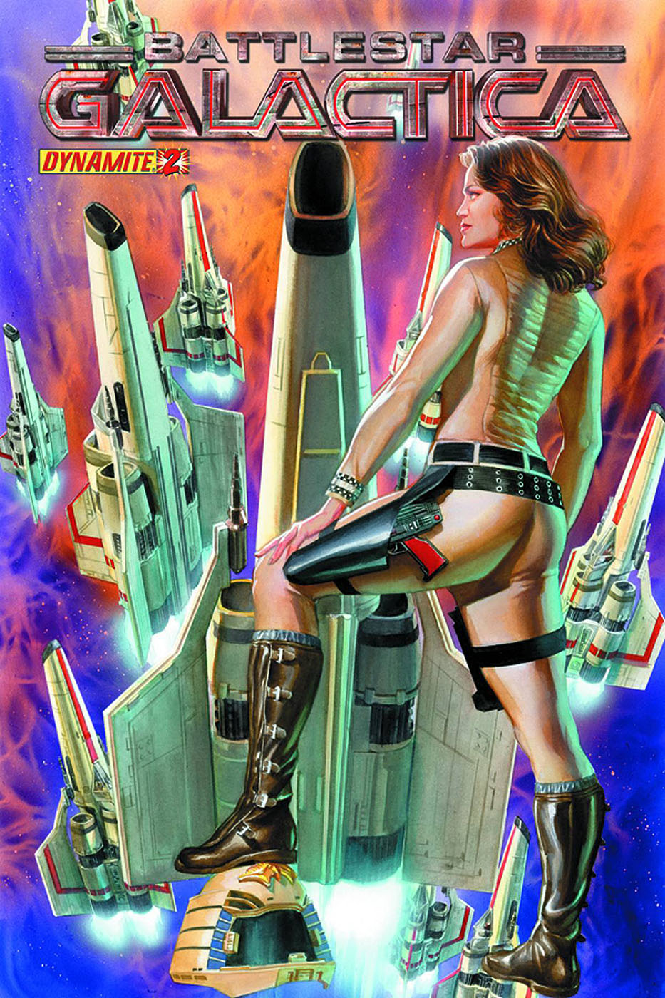 BATTLESTAR GALACTICA #2
Writer: DAN ABNETT and ANDY LANNING
Artist: CEZAR REZAK
Inker: VINICIUS TOWNSEND
Letterer: SIMON BOWLAND
Editor: JOE RYBANDT
Publisher: DYNAMITE ENTERTAINMENT
Cover Price: $3.99
Previously in Battlestar Galactica: Facing a Cylon onslaught, Adama reluctantly deploys Dr. Z’s experimental and illegal time weapons on two modified vipers. Something goes haywire and the entire fleet disappears, leaving Apollo and Starbuck to fend for themselves.
IT’S GETTING ITS BEARINGS
My review of this title’s inaugural issue was decidedly uncharitable. I called it generic and forgettable before, in the most cardinal of sins, comparing it to “Galactic 1980.” Drawing such a foul parallel is something that, once said, cannot be unsaid. But despite a mea culpa on the latter observation, issue No. 1 was not the best beginning for a series. This issue works extremely hard to make a second first impression and it does a fairly good job. Believe me, there’s no shortage of hokey dialogue—which may well be intentional—or tell-don’t-show storytelling, but about halfway through the book things begin to get interesting.
At the first issue’s end Apollo and Starbuck, armed to the teeth with illegal temporal weapons, are left alone in the vipers amid a magnetic storm with neither Galactica nor the fleet anywhere in sight. Eventually we begin to get hints that this isn’t the universe they remember and this is, as I said, where things begin to get interesting. The ending is telegraphed from pretty far away—especially if you’re a genre-savvy reader—but I won’t spoil it.
To clarify: I’m not saying this issue is great, but it’s a nice improvement over the previous installment and, as the story matures, I think we might have a pretty good title here in a few months.
UP CLOSE AND IMPERSONAL
I adore the cover. It has absolutely nothing to do with anything inside the issue, but I love it nonetheless. This is probably because I can’t say no to any image of Anne Lockhart—at least, I think it’s Anne Lockhart—she’s gorgeous in any medium.
The interior art suffers from the same problems as last issue, with perhaps a few improvements. Instrument panels, faces, landscapes—all these things are drawn with too little detail. I understand the pressures and compromises that can result from tight deadlines, but it’s disheartening to see only broad strokes where there should be fine lines. Conversely, the space- and explosion-oriented imagery is done quite well.
BOTTOM LINE: LET’S SEE WHERE THIS IS GOING
I don’t love this book by any stretch of the word, but it’s really trying and I can honestly see it being much better in a few issues. I’m going to stick with it until the end of this arc and, if you’re a fan of the property and have a few extra dollars in your pocket, then you should, too. I’m giving it three Stars of Kobol.
3 Comments
Looks more like Athena (Maren Jensen) on the cover to me.
it is Maren Jensen,had a crush on her when this show was on tv(yes ,dating myself)
I had a crush on Cassiopea. She made me feel “climbing the rope in gym class” kind of funny.