![]()
Imagine a world where you are literally able to buy a better life, straight from your phone. This is the world that Nick Spencer – writer of the popular Morning Glories series – and Christian Ward present to us in their new title: The Infinite Vacation. Find out what I thought after the jump!
 THE INFINITE VACATION #1
Writer: Nick Spencer
Artist: Christian Ward
Letterer: Jeff Powell
Cover Artist: Christian Ward
Editor: Jade Dodge
Publisher: Image Comics
Price: $3.50
Buying a New Reality
‘The Infinite Vacation’ is a smart-phone app that allows you to buy and sell lives with other versions of yourself in alternate realities. From the smallest alterations to the greatest changes in your life, they are all available – for a price, and providing that the other you is willing to sell. Our story focuses around Mark, who averages about 9.7 life-changes a day. But, no matter how many times he changes, he keeps ending up in the same places: dead-end job, failed relationship, alone and miserable. The one version of him that seemed happy is now dead, and indeed, the alternate-Mark death-rate seems to have increased noticeably as of late. Mark tries to find help with this problem but he finds none and, whilst at a coffee shop, attempts to hit on a ‘deadender’ – people who refuse to change, ‘they are like the reality Amish,’ says Mark. Our book ends with Mark in his apartment, feeling sorry for himself, when a version of him bursts through the door shouting, “I know you killed me!”
I loved this book’s plot and premise from the moment I began to comprehend it fully. A better life for a price, never more than a few minutes away but never bringing satisfaction is, of course, a commentary on today’s culture – and a somewhat poignant one, in my mind. It is something that could have come from the mind of Philip K. Dick (which, for me, is a massive compliment, but, as always, your mileage may vary), and I think there is a definite influence in that respect. Most importantly, the premise is clever in and of itself, and that surely deserves praise.
For me, this book is written almost flawlessly, but it is also written in a style that may turn off some people and, in the interests of being fair, I will lay some criticisms at the book’s door that are definitely valid. For one, there is a lot of talking, and very little action. Most of the book is Mark expositing the workings of The Infinite Vacation and the general situation he finds himself in – not much actually happens, in physical terms. I also feel as if the first nine pages (out of thirty two) could have been restructured a little to make for an easier read, as the first five pages don’t really count for much in terms of meaning until pages six to nine, when the concept of The Infinite Vacation is explained.
Some Very Trippy Art
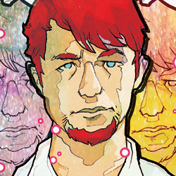
The art has a very surrealist tone to it, which very much matches the tone of the writing. This is one of those books where the art and the story tend to work on separate tracks, if you will, but they’re both of good quality so the book turns out well. And, indeed, the art seems to let the story take a break at times and does its own thing, and throughout the book treats us to two very trippy two-page spreads. One seems to work better than the other – the second spread seems more surreal for the sake of it, rather than to get across a deeper kind of meaning, and so felt a bit off to me.
However, the art does have a few more grounded moments, and I like the way it moves between these and the more surreal portions. Indeed, I wouldn’t say the art is so stylised as to be a put-off – if you only like your art ultra-realistic then, sure, you’re not going to like this, but in this book people look like people for the most part, and I didn’t find the surreal bits confusing at all, so even if this kind of art really isn’t your thing, I don’t think you could ever call it bad.
Also worth talking about are pages six to nine, which present an advertisement for The Infinite Vacation, because these pages feature photographs (by Kendall Bruns) rather than illustration. This is OK, I suppose, but I don’t really see the need for it – why couldn’t this section have been accomplished using the normal art? Whilst it does serve to mix up the visual tone a little, I don’t see what this brief variation really adds to the book. Then again, it doesn’t take away from the book either, so it works out moot.
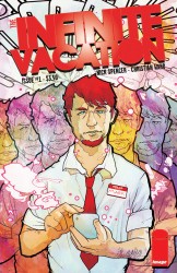
The cover features Mark, with some different coloured versions of himself behind him. The art is the same as in the interior, and it really captures the feel of the book, whilst also hinting at the premise, but in such a way that only becomes fully clear after having read the thing. It is also colourful and eye-catching, and I especially like the logo, which is very bold and is sure to stand out from the crowd.
Buy It, or Buy Into Different Reality where You Did
I really did love this book, and as the plot is exactly the sort of thing I’m in to, seemingly inspired by my favourite author – how could I not? The art expertly captures the feel of the book, and serves up some great visuals. This is not a book for everybody, I’ll warrant, but if anything I’ve said here intrigues you then I very much encourage you to go out and buy this issue – it gets five stars out of five from me.


