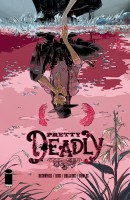
Pretty Deadly is Image’s new western series by Kelly Sue DeConnick, known for her work on Captain Marvel and Avengers Assemble. There is some stiff competition in the western genre right now with quality titles like All-Star Western and The Sixth Gun, but perhaps Pretty Deadly will blow them away. Find out how it is with your Major Spoilers review!
SUMMARY
Pros
The art is top notch and the designs are great
The story has an appealing mythic feeling to it
Cons
Purple prose
Confusing and vague story
READER RATING!
[ratings] Pretty Deadly #1
Writer: Kelly Sue DeConnick
Artist: Emma Rios
Colorist: Jordie Bellaire
Letterer: Clayton Cowles
Publisher: Image Comics
Cover Price: $3.50
LOST IN THE WEST
Pretty Deadly is incredibly confusing right from the start, opening with a bunny narrating the unfolding story to a butterfly, imagery reminiscent of a Native American origin story. The two leads, a blind marksman named Fox and a young, raven cloaked, girl named Sissy, then start telling us a second story within the first story. This second story is all about the origin of a rider of death, and sets the tone for this mythical western setting. While it is only a few pages long, it starts the issue off in an incredibly disorienting fashion. Things get slightly more concrete from there plot wise, but there very little explanation for anything in this mystically charged west. The state of things will obviously become more clear as the series progresses, but as it stands this issue alone leaves things just a little too vague. A good first issue should give the reader just enough of the plot and characters to want to know whats happening next, but this honestly feels like I started reading a series halfway through. All of this confusion rests in a blanket of purple prose that comes off as distracting and a bit pretentious.
PRETTY PRETTY
The art in this book is just amazing. Vibrant colors, inspired yet tempered designed, and satisfyingly realistic anatomy make this whole thing a treat for the eyes. In all honesty, if the art was less I might not have stuck it all the way through the first issue. Sometimes the art comes off as too cluttered and confusing, and I am left lost, but I blame this more on the writer trying to fit a ton of different things on one page over poor artistry skills.
BOTTOM LINE: MIGHT BE WORTH A SHOT
Overall I have some trouble recommending this book. The art might be worth it for those who really value style over substance, but for those looking for a satisfying read this is just a let down. For those who are really hurting for another western series, and have already exhausted all there is to offer, might consider sticking it out on this to see if things pay off down the line. Over all I’d suggest waiting for the trade so as to get a more complete story experience.


2 Comments
“but for those looking for a satisfying read this is just a let down”
I found it pretty satisfying, but I don’t need each issue to be a standalone work. As part of a larger story I’m sure things will start to make more sense. Maybe it will read better in trade?
I agree about the art, but I think you’re being too harsh on the story.
The art is good and the writing is fine. Looking forward to the next issue. And if you haven’t somebody over on tumblr put Ginny’s song to music and it is awesome!