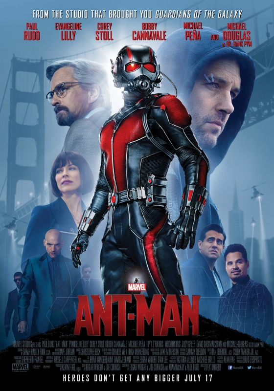
With Avengers: Age of Ultron out in theaters around the world it’s time for Marvel to switch to a smaller marketing gear and focus on Ant-Man. Step one: new poster!
Marvel had been on a fairly strong streak of marketing with this almost entirely white poster and the small billboard for Ant-Man. I say had because the latest poster falls in line with the standard fare that Marvel puts out for their films.
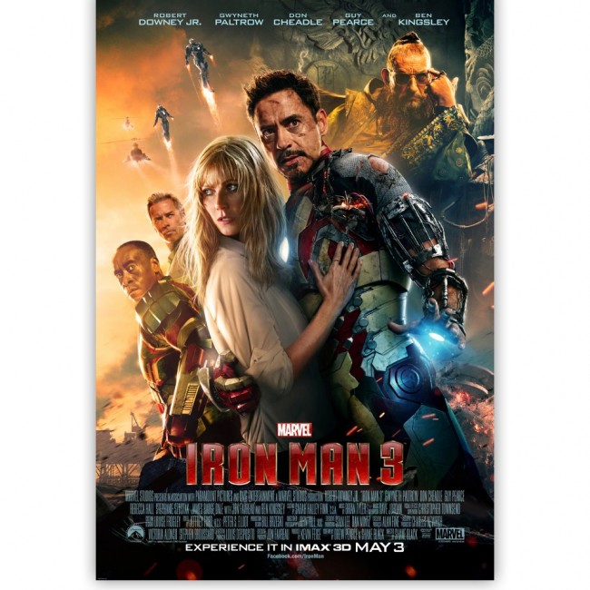
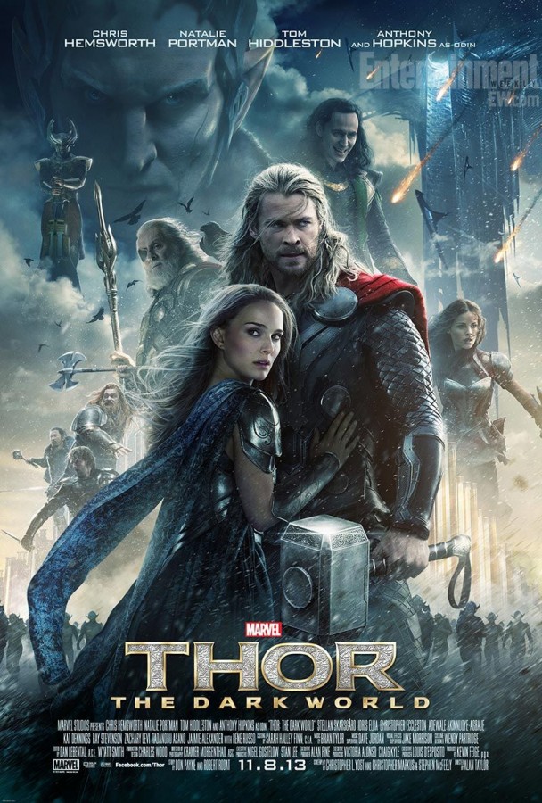
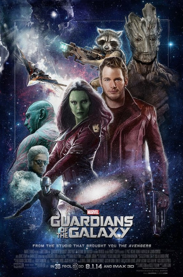
Is there anything wrong with the poster? No, not really, I just can’t help but feel that an opportunity to put out a product that would be spread by fans all over the Internet was lost. But even worse it gets lost in the sea of other Marvel posters just like it. Look at these Iron Man 2, Thor 2 and Captain America posters, same scheme each time.
What are your thoughts on the new Ant-Man poster? Do you like it or would you rather see a piece that stands out more?


![[Movies] Ant-Man gets a familiar looking poster](https://majorspoilers.com/wp-content/uploads/2015/05/AntMan_New_Poster.jpg)


4 Comments
I still like the idea of the Ant Man poster being super tiny with a magnifying glass in front of it, but this one seems fine, nothing wrong, but nothing spectacular either.
Huh… It also just just hit me that the bald guy in the background isn’t Xavier. XD
At least Ant-Man isn’t holding a damsel in distress in his arms
You never know, maybe he’s got somebody in his pocket.
Funny thing is that I just watched a commentary about how generic movie posters have gotten in the past few years…these are perfect examples.
(Note, I said generic, not bad. They look fine, and do catch the eye, but they also don’t stand out as very memorable.)
https://www.youtube.com/watch?v=VXJiBkFgprQ