


Or – “Sometimes, A Single Creator Makes All The Difference…”
In recent years, I’ve gained a great appreciation for the writing skills of Kieron Gillen (not to be confused with Karen Gillan) and when I heard he was taking over the reins of Iron Man for the Marvel NOW! launchboot, I was intrigued. Then, they announced the artist for the book… Good writing can make or break a book, but can it overcome the weaknesses of a collaborator? Your Major Spoilers review awaits!
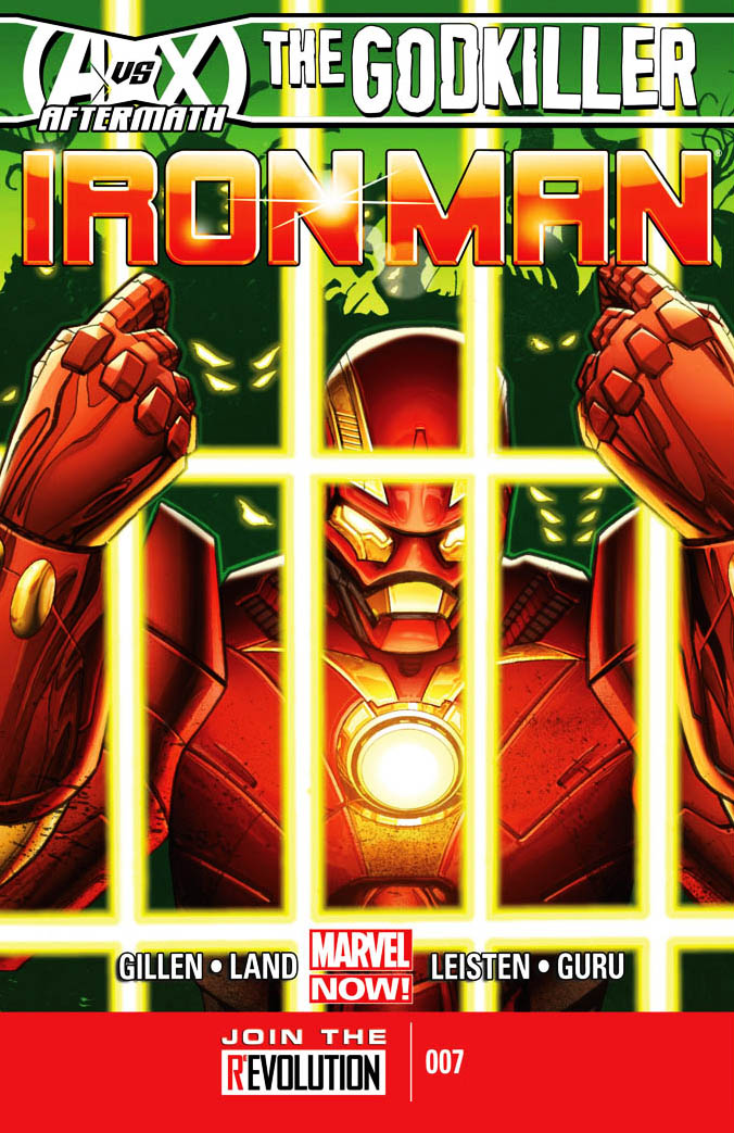 IRON MAN #7
Writer: Kieron Gillen
Penciler: Greg Land
Inker: Jay Leisten
Colorist: Guru eFX
Letterer: VC’s Joe Caramagna
Editor: Mark Paniccia
Publisher: Marvel Comics
Cover Price: $3.99
Previously, in Iron Man: Tony Stark, fresh off his victory against the cosmic Phoenix Force, has decided that it’s time to branch out, leaving Earth behind in his search for new vistas. Traveling into space with his new armor (complete with an artificial intellegence named P.E.P.P.E.R., based on the mind patterns of former squeeze Pepper Potts), Iron Man has a grand old time until he is taken into custody by an alien race for an unspeakable crime: Deicide.
NO GOOD DEED GOES UNPUNISHED.
Tony opens the issue in a Voldi prison, held for crimes against their people and the “Void Falcon,” their name for the Phoenix Force. Gillen does a great job with Tony’s internal monologue, throwing in some excellent Star Wars references, before a robot arrives with a drink and a plan. The creature is a Rigellian Recorder, a cybernetic organism whose sole purpose is to record everything. This particular Recorder, however, has decided that simply observing is not enough, and has offered his services to break Tony out of jail through the clever use of an old ploy: The rite of ritual combat! The only real problem that I have with the issue is the expectation of jeopardy on the part of our main character, as even Tony himself doesn’t seem to take the threat of being executed in space seriously. Of course, that may just be the famous Stark overconfidence in play, but either way, he stands before the Tribunal with a cocky smile, playing out his endgame. The smile is an issue for me, as the repeated use of the same stock facial expression doesn’t seem so much like continuity as a valiant attempt by a VERY limited artist to keep these pages fresh.
FOUR FACIAL EXPRESSIONS AND PHOTOSHOP.
My feelings on the art of Greg Land are no secret: I find his work to be stiff, overly-reliant on photo-reference, and very poorly laid out, and this issue is no different. As Tony goes into battle, he suddenly ends with the build and facial features of former WWE Champion Randy Orton, but that resemblance ends when the endlessly stiff combat sequence does. Several of the headshots seen throughout the issue are identical, and the final page, with it’s appearance by a mainstay of 90s Marvel Comics, features a guest whose identity cannot be discerned visually, and has to be identified in dialogue. Of course, given that he’s about three times the size he was last time I saw him, this may be an entirely new body for the guest-star (*coughdeathsheadcough*), which would justify the redesign, but it just comes across as Land drawing another vaguely featureless robot. Writer Gillen has a great hook for the Iron Man/Tony Stark character, carrying over the successful Matt Fraction take from Invincible Iron Man, but his plotting and dialogue are hampered by dull and uninspired artwork that can’t ever quite decide what the protagonist should look like, other than “having a goatee.”
BOTTOM LINE: A REAL MIXED BAG.
If you can get past the visual flaws (like Stark’s cell being a mostly-featureless empty room or the fact that the brief appearance of The Scarlet Witch and Hope Summers gives them identical pnuematic porn-star bodies), there’s a lot to like here. Iron Man IN SPAAACE is something we haven’t seen before, and the idea of Tony crossing paths with the renewed Guardians of The Galaxy, as promised by the solicits, is one that I wholeheartedly want to enjoy. It’s just that art… Iron Man #7 reads well, is paced okay, and even has some excellent moments plotwise (as he fights off each opponenent, Tony is declared not guilty of another of the court’s charges against him), but looks alternately bland and traced, earning a very conflicted 2.5 out of 5 stars overall. I can’t help but wonder how kinetic and awesome the visuals for this issue could have been under the pen of previous artist Salvador Larrocca…


DID YOU READ THIS ISSUE? RATE IT!
Reader Rating
[ratings]
5 Comments
So is Death’s Head in this??? Freaking awesome, love DH since his first appearance on the back of Marvel UK comics (where he was originally the size of a Transformer before McCoy era The Doctor shrunk him down to human size). Never cared for DH 2. Thanks for the review. :-)
I am a big Kieron Gillen fan. I picked up the first issue of Iron Man and haven’t got another since due to Greg Land’s art. I could stomach in on Uncanny X-Men, but something about it on Iron Man just hurt too much.
That new armor is ugly
I would have remarked on that, but (other than the cover and the recap page) the ugly armor doesn’t actually appear in the issue…
I am just a fan that we’re about to see a fight with Death’s Head, yes?